
No brand in the world would stake its logo on a fight. Wrestlers do. In Mexican lucha libre, a lucha de apuestas puts a wrestler’s mask on the line. The loser must remove it in front of the entire audience, revealing the face behind the character. And yet, some masks have remained instantly recognizable for more than seventy years. El Santo was buried wearing his mask. And everyone (Lucha fanatic or not) can easily recognize Blue Demon’s Mask
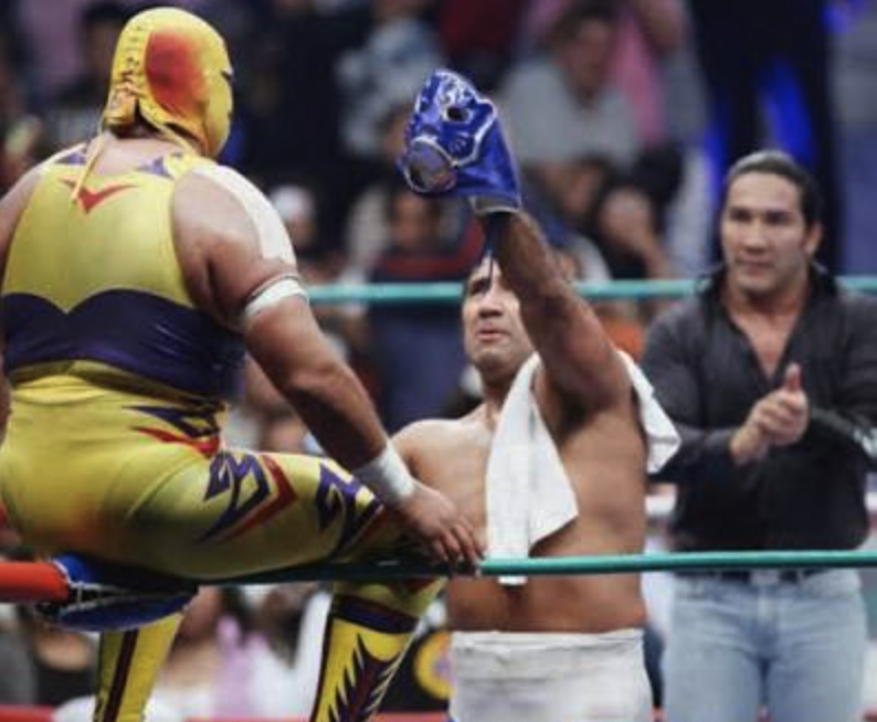
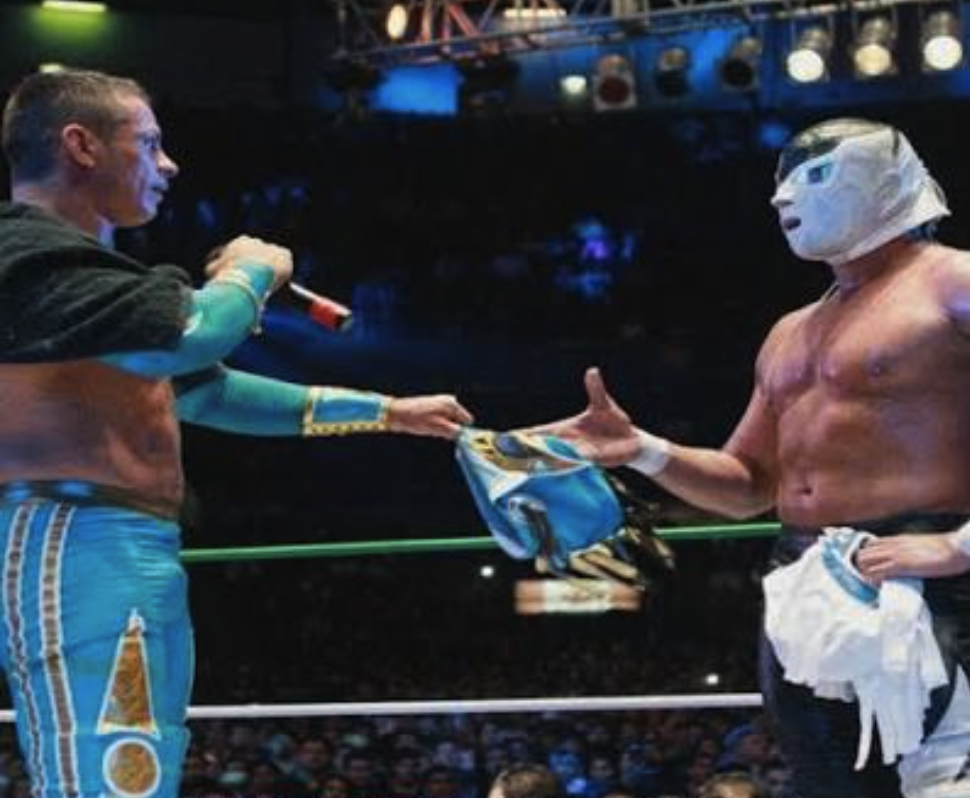
What these iconic masks have in common from a branding perspective: what makes them distinctive, why people collect them, and how they withstand the test of time. Along the way, we’ll uncover five questions you can use to evaluate any identity, whether it belongs to a wrestling mask, a logo, or a personal brand.
A Mask Is a Complete Identity System
A mask doesn’t hide the wrestler. It creates him. In a single object, it brings together what branding typically spreads across several deliverables: the name is the naming, the shape is the logo, and the color is the palette.
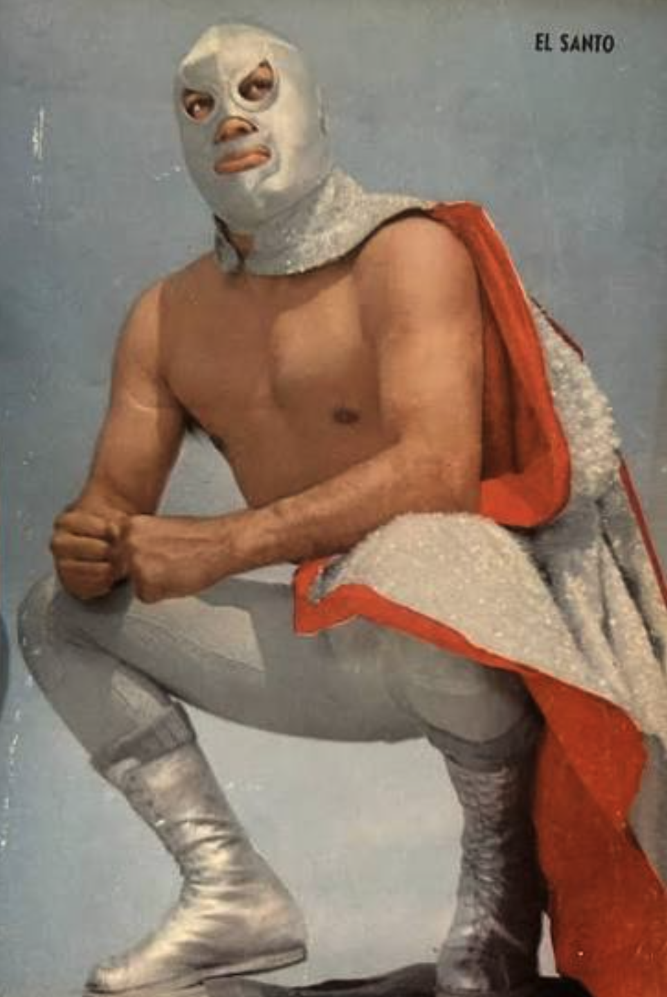
El Santo’s first mask, worn on July 26, 1942, was made of silver leather with rough stitching. There was no brand manual, no formal design system. Just an idea clear enough to survive even the imperfections of its execution.
Color as Positioning: Silver and Blue
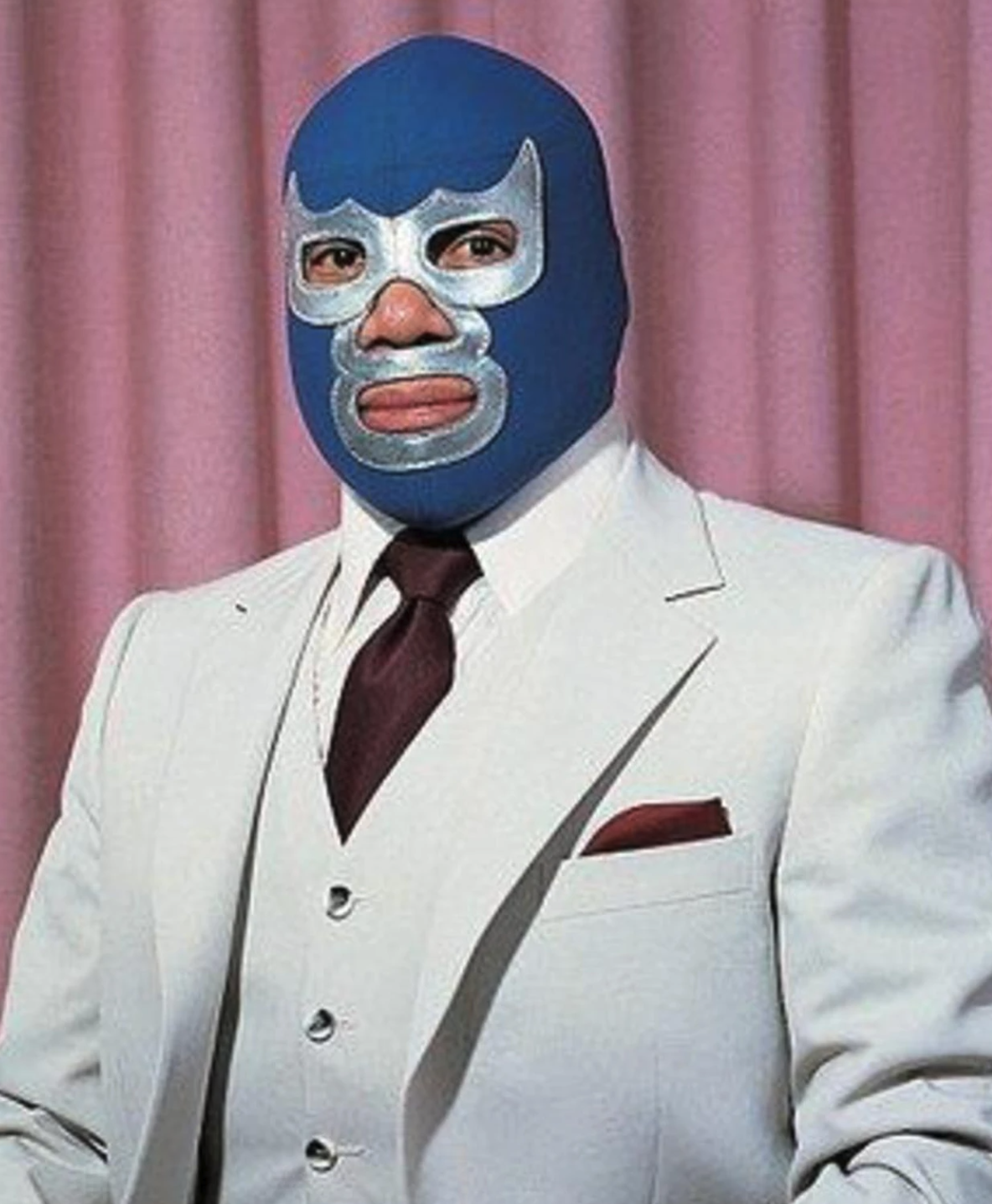
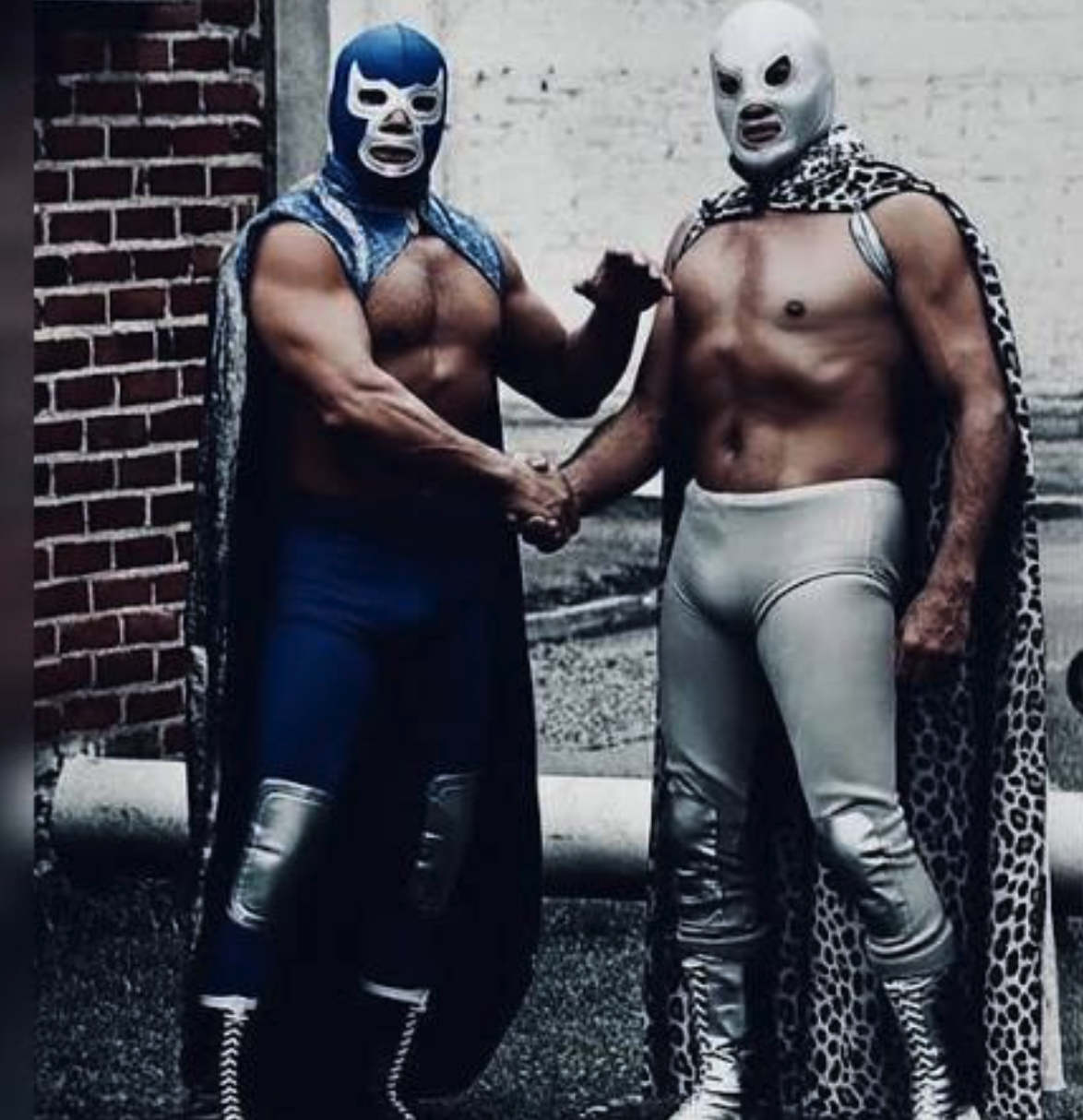
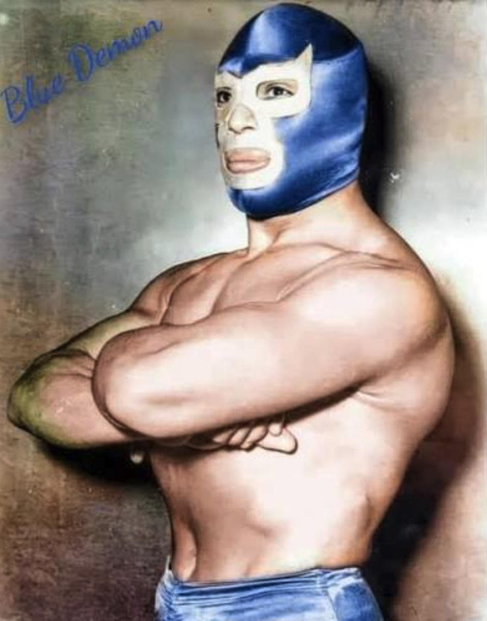
El Santo is silver. Blue Demon is blue. He debuted in 1948 wearing an entirely blue outfit, mask included. His name “Blue Demon” the pattern on his mask, and his color communicated exactly the same idea. His mask combines blue and silver, but blue is the color that defines the character.
They were rivals, yet each could be recognized by a single color. That’s positioning: occupying a distinct place in the audience’s mind without having to explain who you are.
What You Risk, You Protect: The Mask Match as Forced Rebranding
Most brands risk market share. A masked wrestler risks the entire brand.
El Santo never lost his mask in a match, and Blue Demon never lost a mask-versus-mask wager.
Dr. Wagner Jr. did. He wore his mask from his debut in 1985 until August 2017, when he lost it to Psycho Clown at Triplemanía XXV, held at Arena Ciudad de México. After 32 years behind the mask, he had to step into a new identity, with his face exposed: Rey Wagner.
In branding terms, it was a forced rebrand, carried out in public, with no room for a gradual transition. TV Azteca described the bout as one of the most recognized mask-versus-mask matches of the decade.
There are two ways to endure. One is the El Santo and Blue Demon approach: never lose the asset. The other is the Wagner approach: build a brand around a surname that remains active across three generations Dr. Wagner, Dr. Wagner Jr., and El Hijo de Dr. Wagner Jr. La dinastía Wagner
People Collect Masks Because They Wear Them
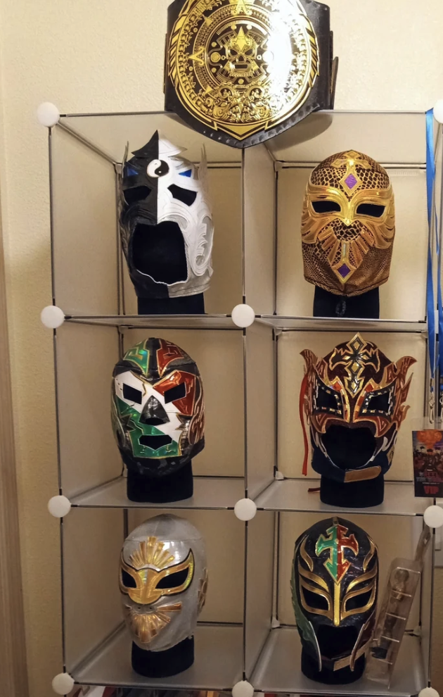
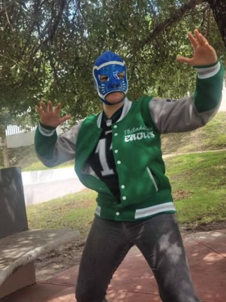
Audiences don’t just buy a logo. They put a character on their own faces.
Any brand would pay a fortune for customers willing to wear its identity. In lucha libre, customers actually pay for the privilege.
That’s one reason wrestling masks work so well as collectibles and merchandise. Each one embodies an entire character, and the possibility of losing it is real. That risk gives the object an additional layer of meaning and value.
Mil Máscaras and the Identity Anchor
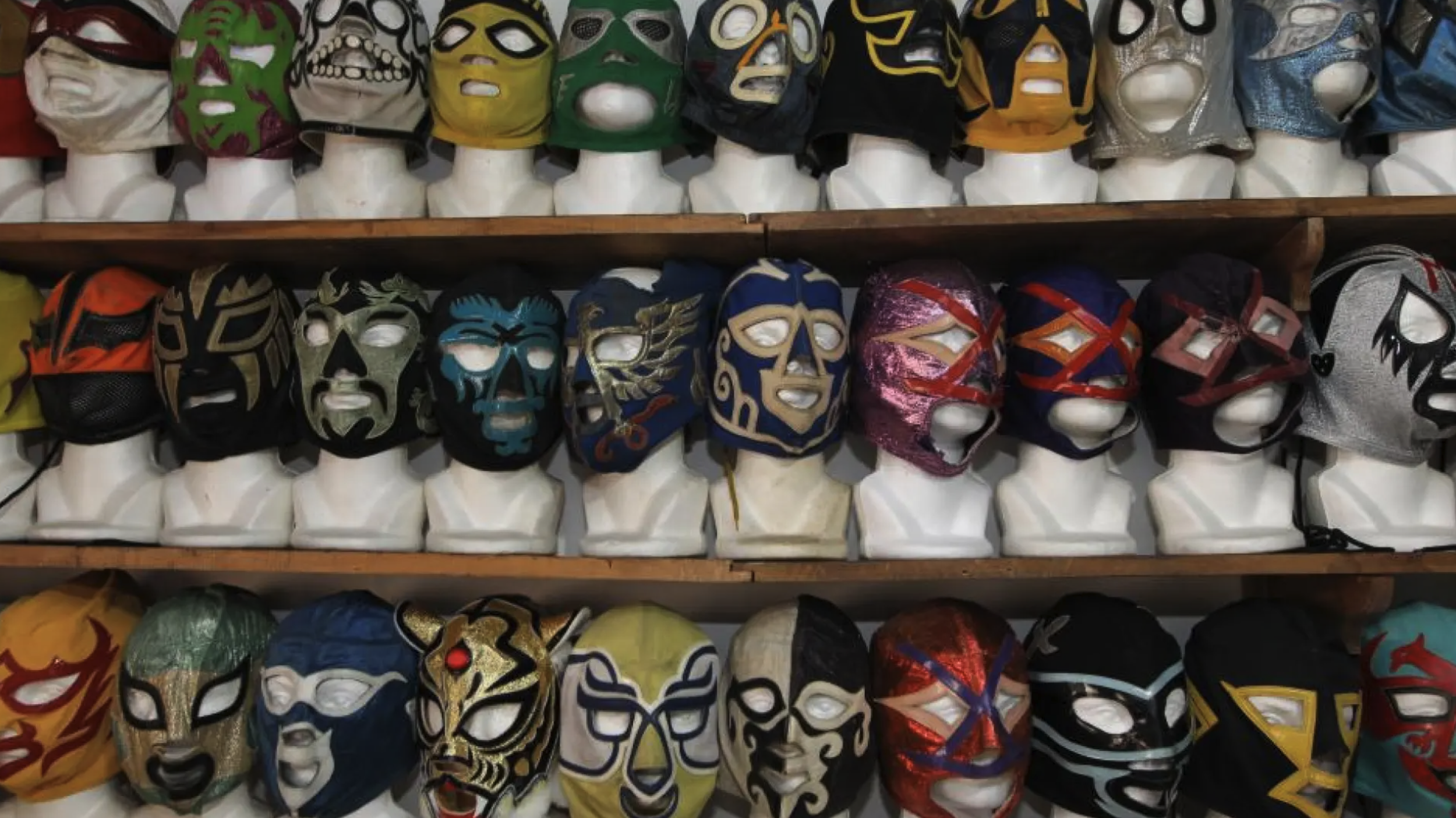
Mil Máscaras’ name says it all: a thousand masks, one character. The design changes, but the identity remains.
In design, this is known as an identity anchor: the element that stays constant (the name, the concept, the story, and in some of his masks, that teardrop shape for the eyes and the M logo on the forehead) allowing everything else to evolve without breaking the brand.
The same principle applies when designing a mask. Colors and materials can change as long as the defining patterns remain intact. A system with an identity anchor can evolve. One without it has to reinvent itself from scratch every time.
The Rule: Know Your Why
Simon Sinek distilled this idea into his Golden Circle: organizations that communicate effectively start with why, move on to how, and finish with what. The masks that endure can be understood in the same way. Behind every line is a name, a character, and a story. The design follows from them.
The enemy isn’t any particular person, nor is it a lack of talent. It’s a habit anyone can fall into: designing without a why. Following a trend, copying a visual device, or making a decision simply because “that’s how it’s done.”
Design created because it’s fashionable lasts as long as the trend. Design grounded in a story has the potential to last for decades.
But Good Design Alone Isn’t Enough
El Santo starred in 52 films and had his own comic book. Blue Demon headlined a series of films between 1961 and 1979, often alongside El Santo. The movies, comics, and wrestling ring all told the same story.
That’s consistency: an identity showing up in a recognizable form at every touchpoint.
Ownership matters, too. El Santo is a registered trademark, and his son inherited his mask. In Blue Demon’s case, according to Wikipedia, Alejandro Muñoz’s biological son holds the “Blue Demon” trademark, while Blue Demon Jr., who continues the blue-and-silver tradition, holds the “Blue Demon Jr.” trademark.
The name was divided between them. When a name carries enough value to be claimed and protected in its own right, it has become more than a label. It has become an asset.
Where the Analogy Breaks Down
A mask isn’t a logo in the strictest sense. A logo is a sign. A mask is a sign with a person inside it, someone who moves, who can lose it, and whose identity can be passed down in ways a logo cannot.
Nor can El Santo’s and Blue Demon’s longevity be explained by design alone. Their lasting impact also depended on cinema, comics, trademark protection, and the people who carried their legacies forward.
The useful lesson isn’t “design something well and it will last.” It’s this: design something that can be sustained, protected, and passed on.
Five Questions to Evaluate Any Brand Identity
Can you hear the name and picture the image? The name and the visual form should point in the same direction.
What is the one thing that will never change? That’s your identity anchor.
What makes you recognizable without explanation? A color, a shape, a gesture, something people recognize before they read a word.
Who will wear your identity? Think about the people who use it, not just the people who look at it.
Who will inherit it, and what protects it? Trademark registration, consistency, and someone willing to carry it forward.
A logo is something you look at. A mask is something you inherit.
Design something someone will want to inherit.
