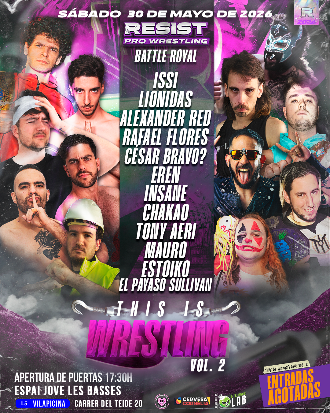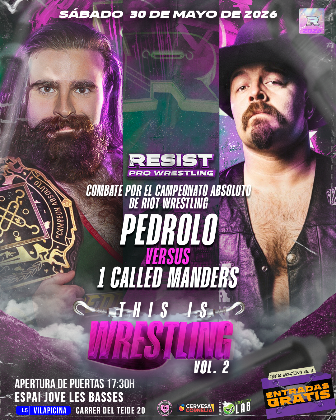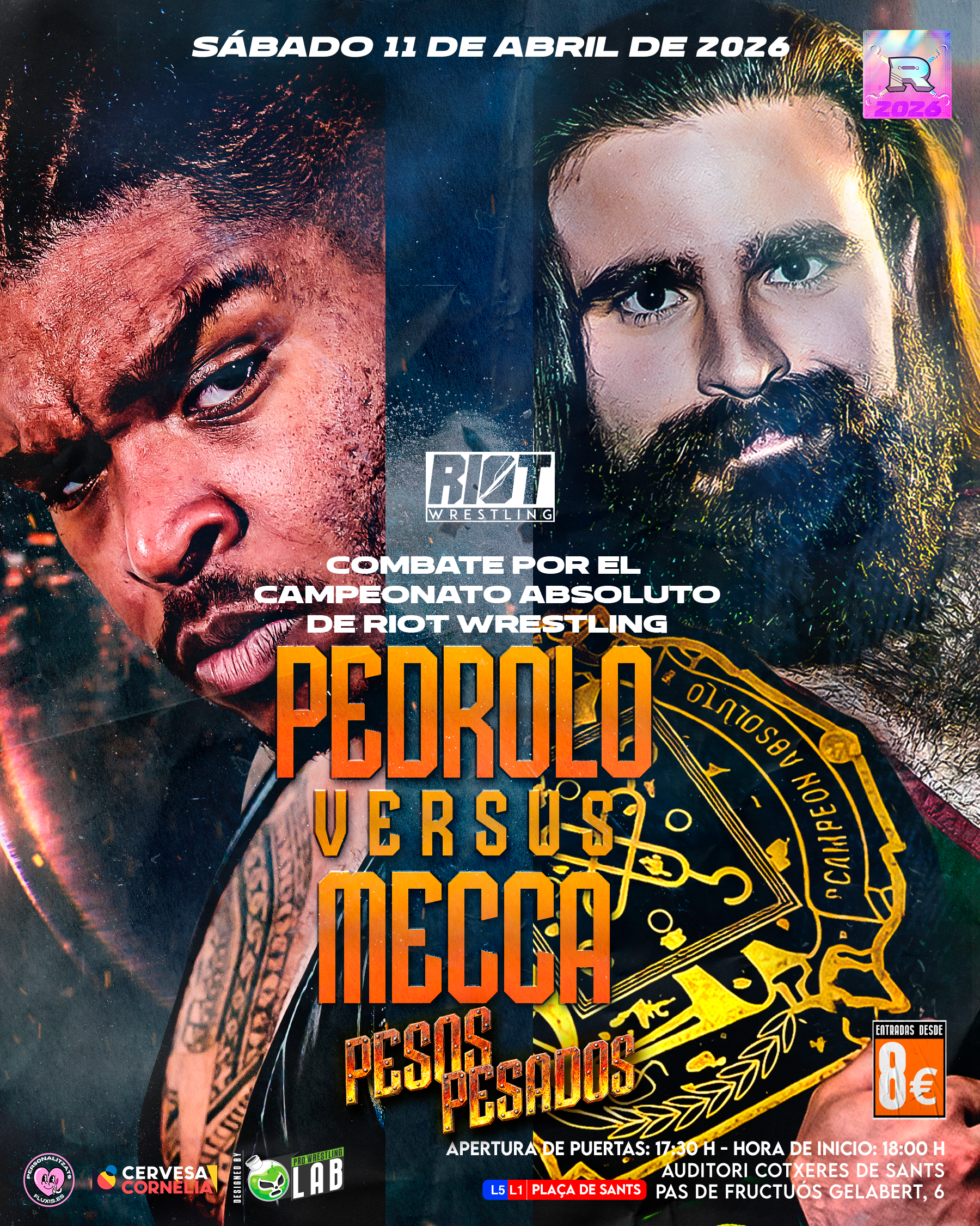

A Full Season of Posters for Resist Pro Wrestling
What I Learned Looking Back
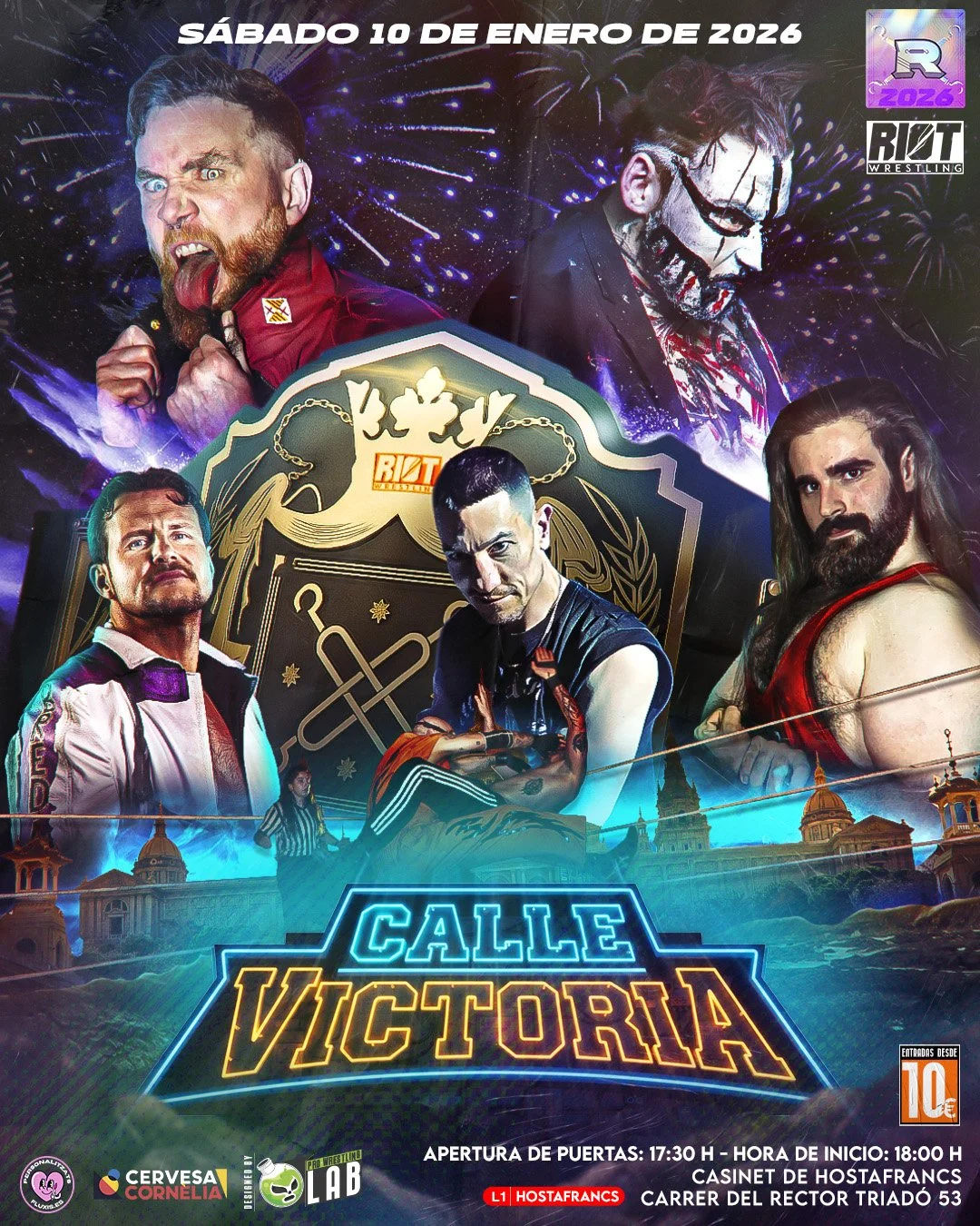
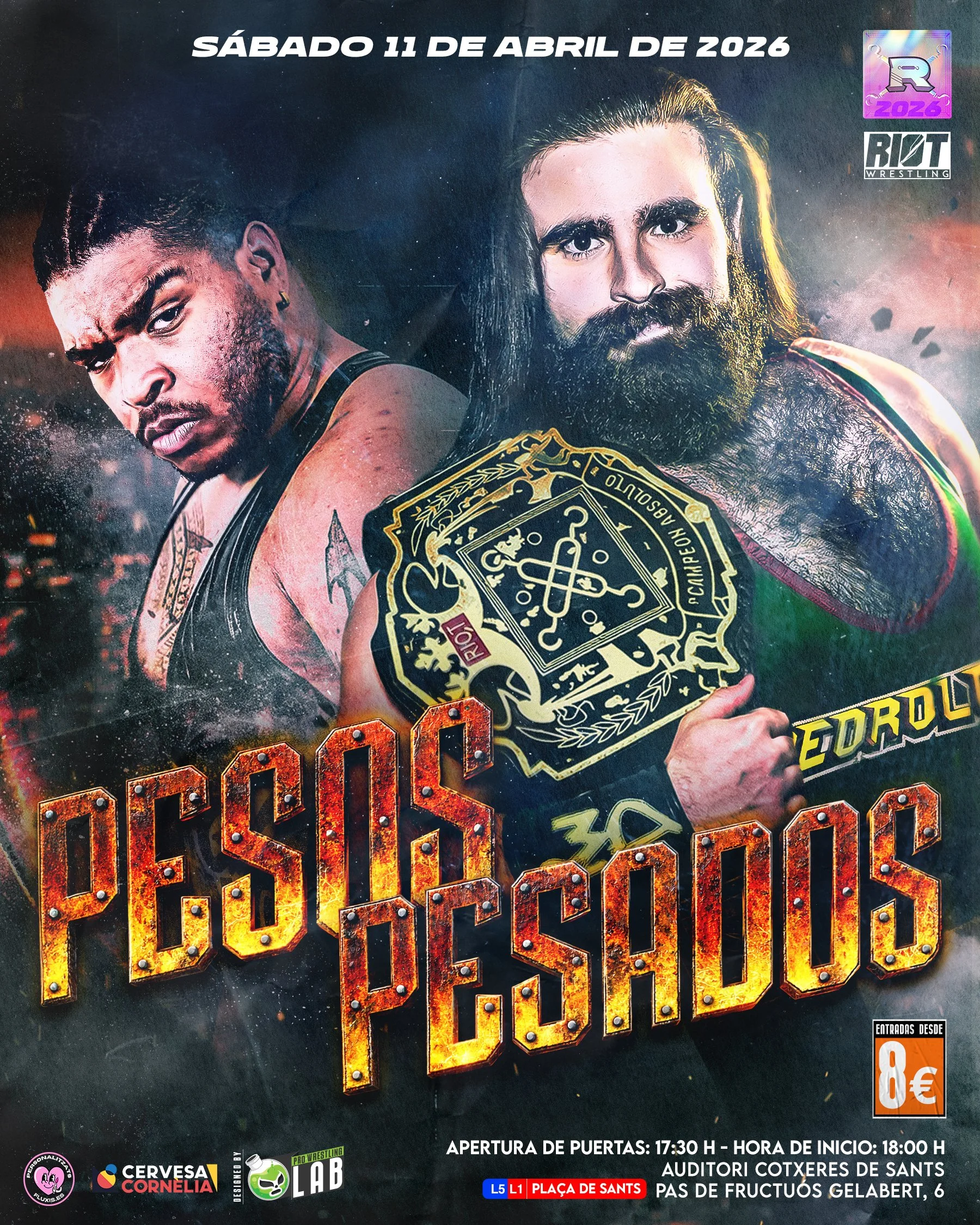
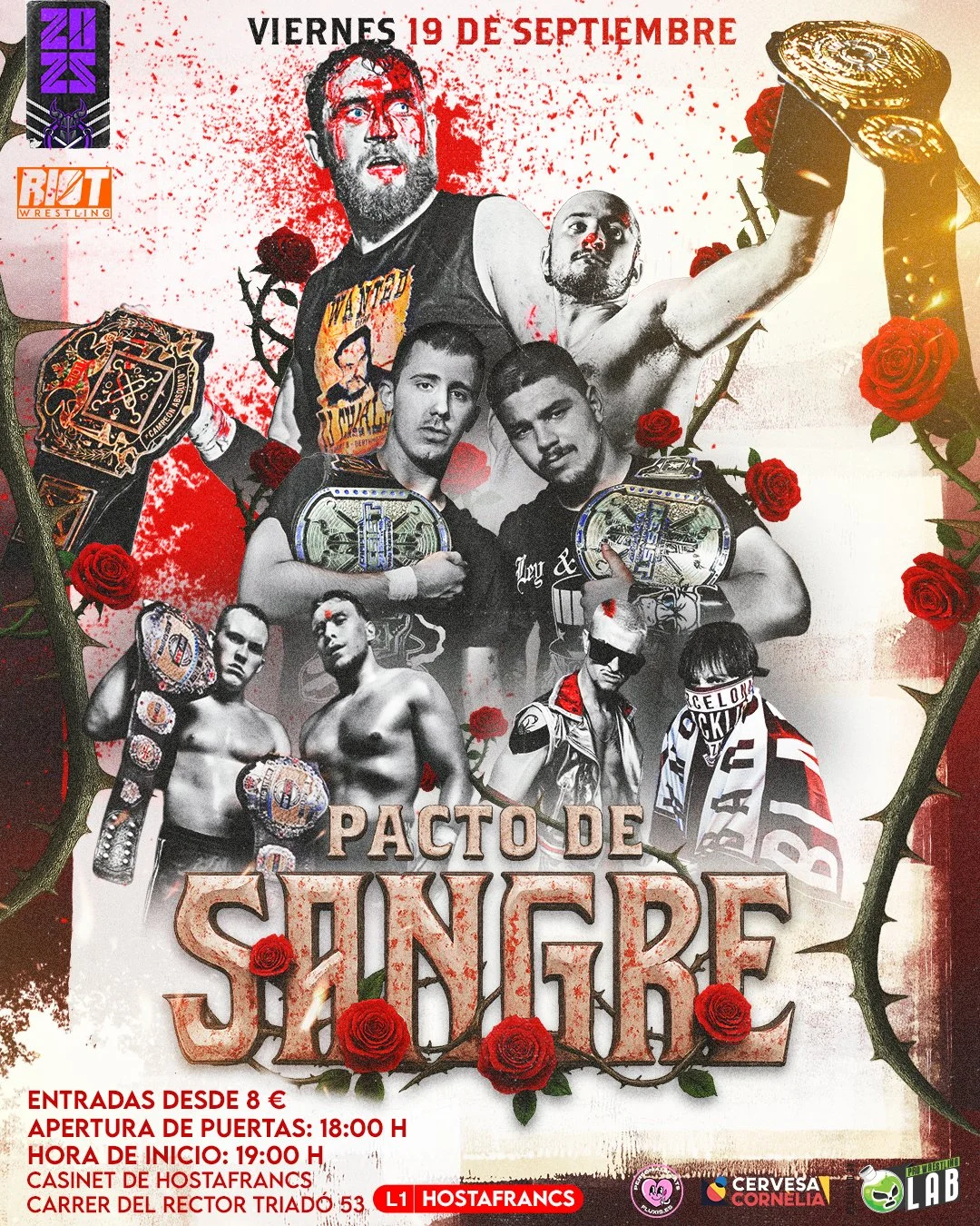
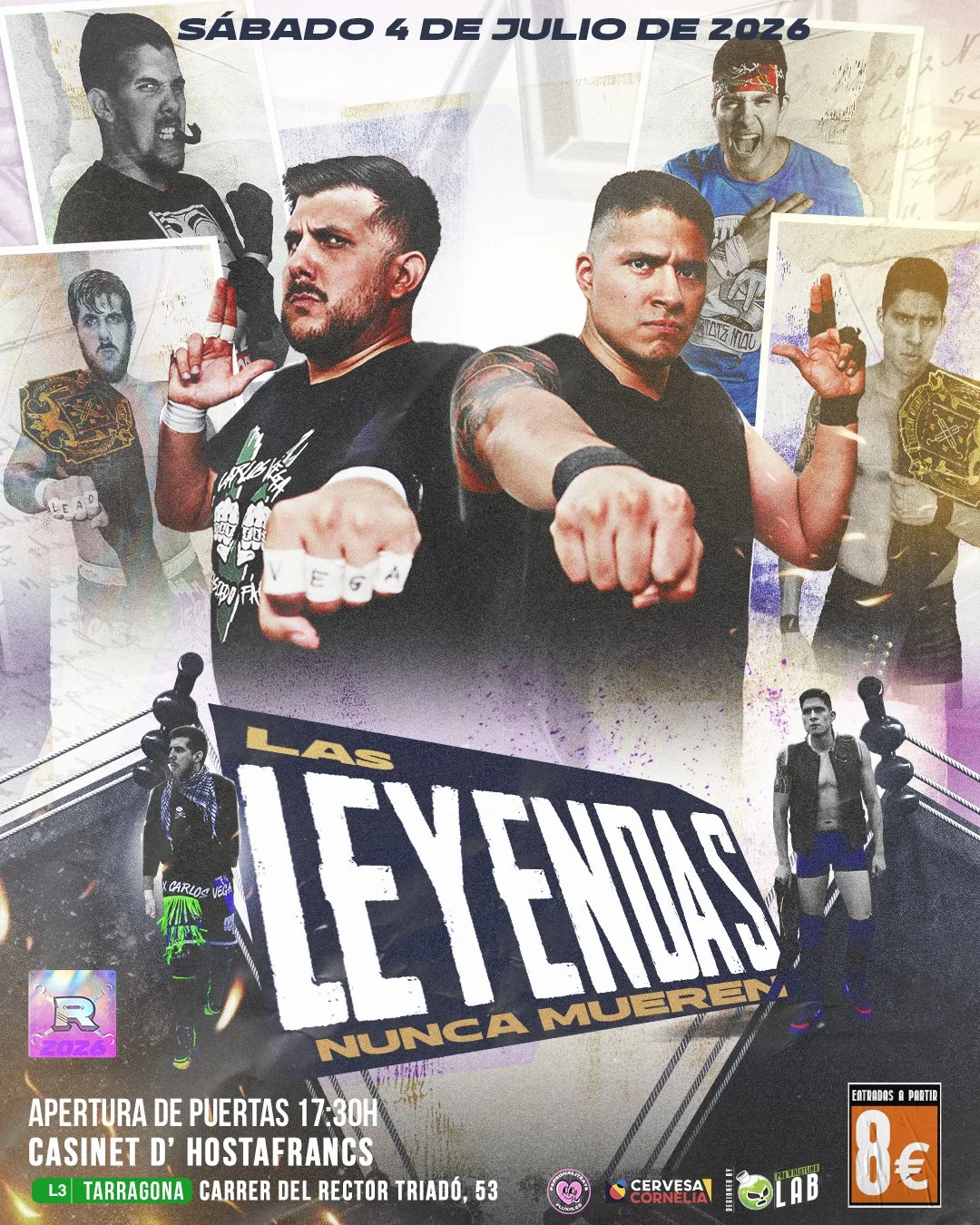
Summer break just hit. And for Resist Pro Wrestling (the promotion I wrestle for, and the one I design for) that means a full season has officially closed.
Before the next one starts, I wanted to take the time to actually go back and look at everything I made. Not just to admire the work, but to understand it. How the ideas moved. How the style changed. How a single concept on a poster could end up living somewhere else entirely, like a titantron months later.
The Rule I Followed All Season
If there's one rule that guided every piece of work this season, it's this: never just "make it look cool."
Every poster had to come from somewhere. That somewhere was usually the booking team (our client), in every sense that matters. Sitting down with them, figuring out what they actually wanted the crowd to feel before the show even started. A theme. A concept. Something that gave the audience a hint of what was coming, before a single bell rang.
That's the process behind most of the posters you'll see from this season. But not all of them.
When There's No Concept; But There's Still a Reason
Some of these posters were pure branding. Made for people who weren't even in the building yet, audiences outside our regular crowd, seeing Resist Pro Wrestling for the first time through a piece of art rather than a live event.
No storyline behind them. No show concept to hint at.
And that's exactly the distinction worth sitting with: no concept doesn't mean no intention.
The enemy was never "there's no concept here." The real enemy is designing without ever asking why. Even a poster with zero story behind it still needs a reason to exist — a reason for the colors, the composition, the tone. If you can't explain the why, the piece isn't finished, even if it looks finished.
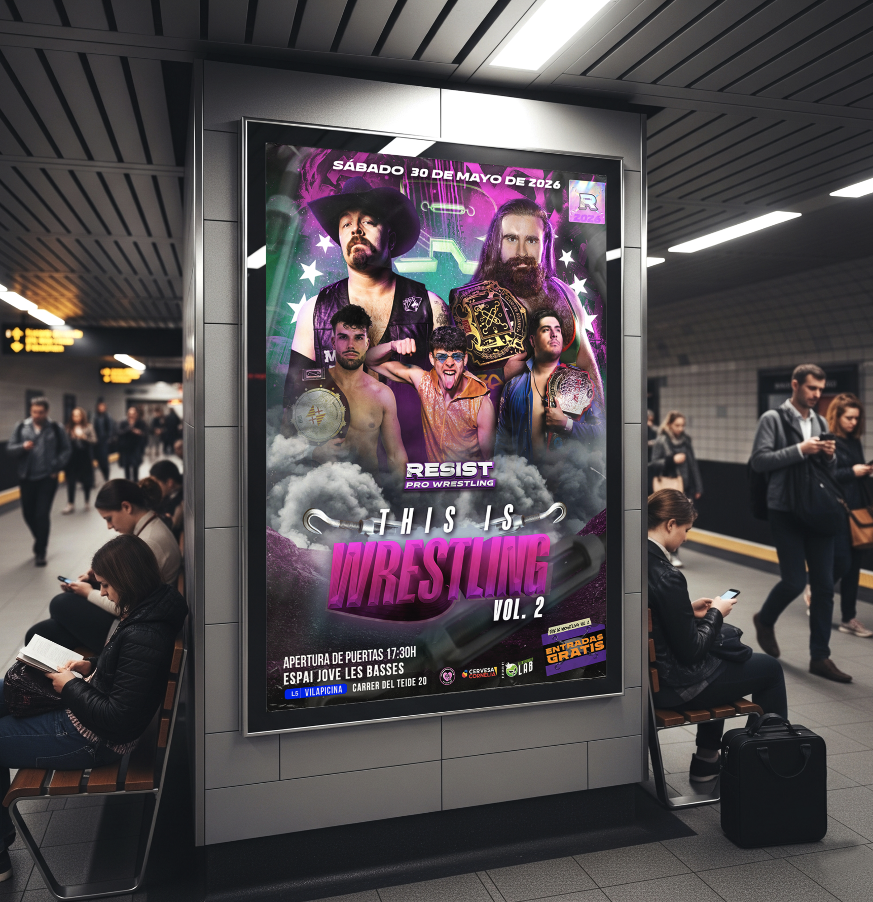
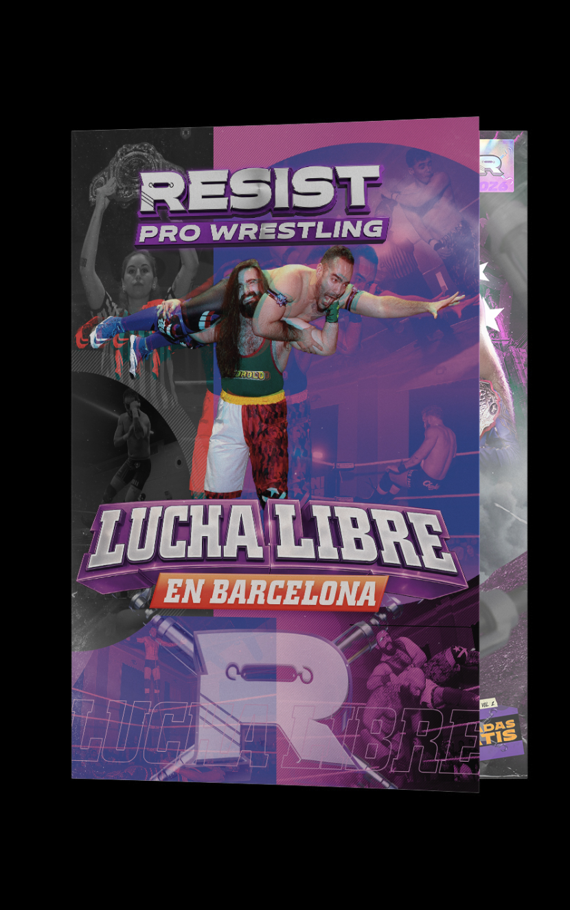
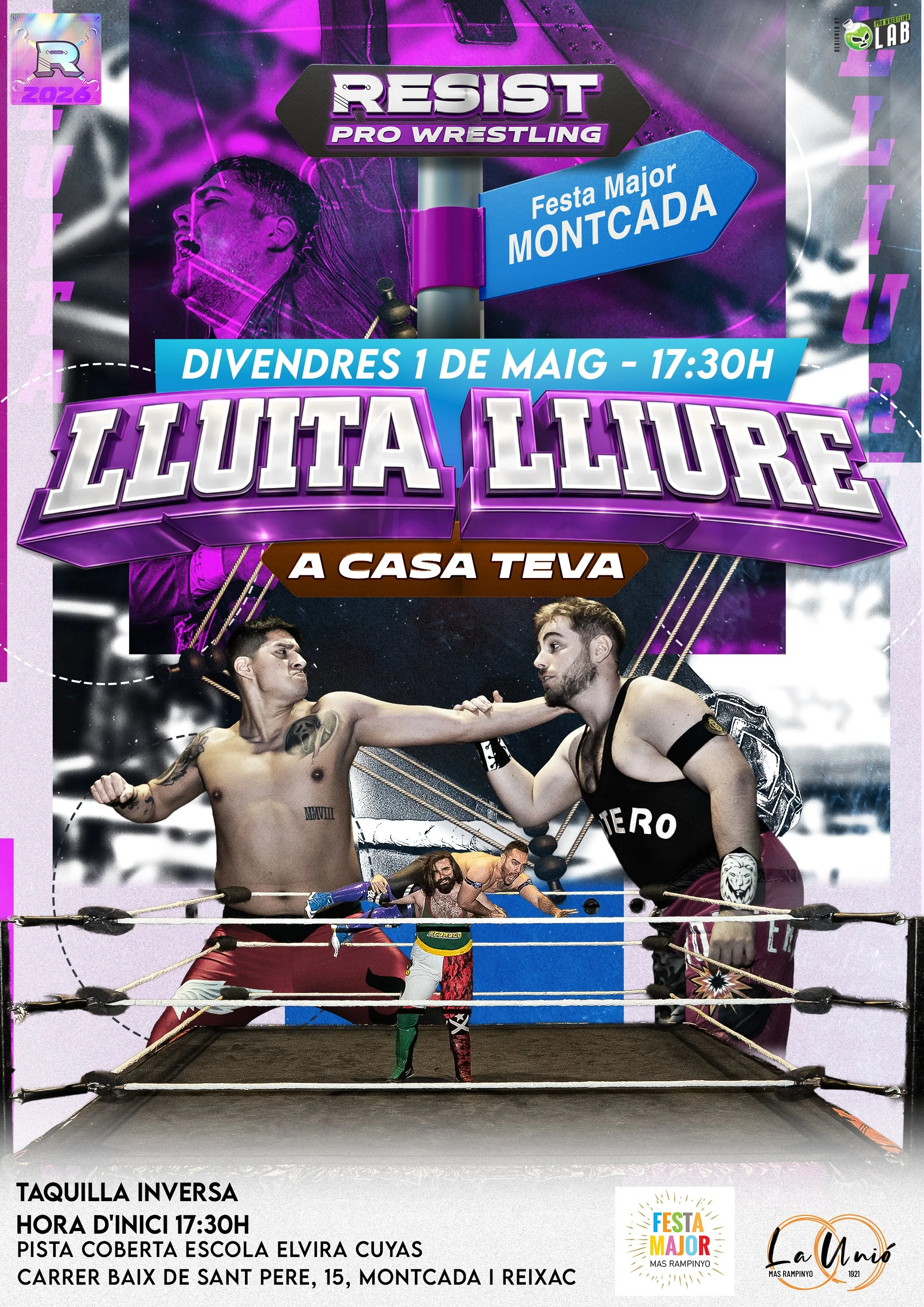
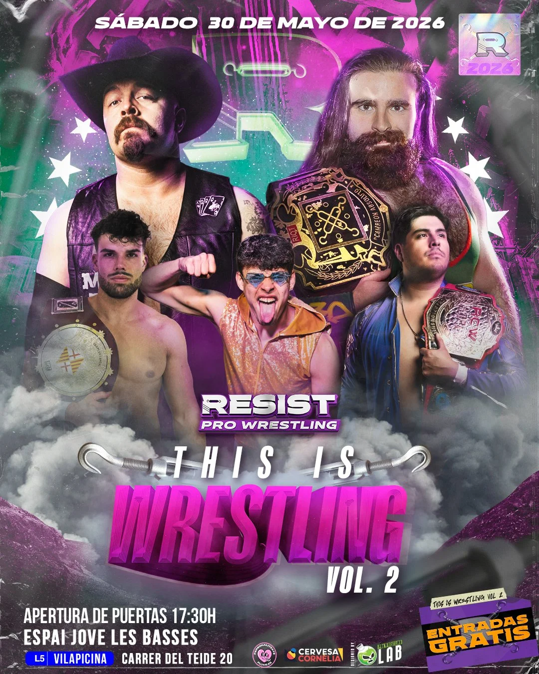
Watching the Style Develop in Real Time
Looking back at the full run of posters chronologically, you can actually watch the growth happen. Show after show, the execution got stronger. The confidence in the visual choices became more obvious. That's not something I planned out in advance, it's just what happens when you're producing consistently and paying attention to what worked and what didn't.
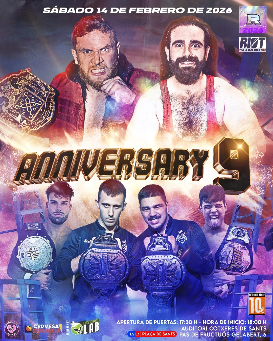
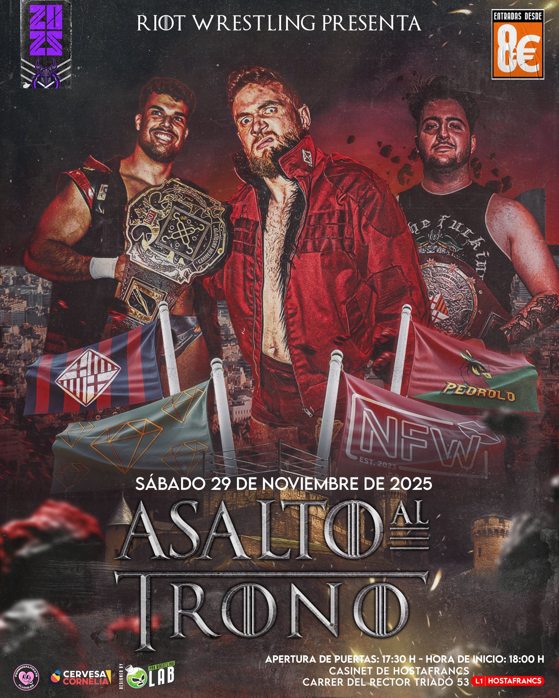
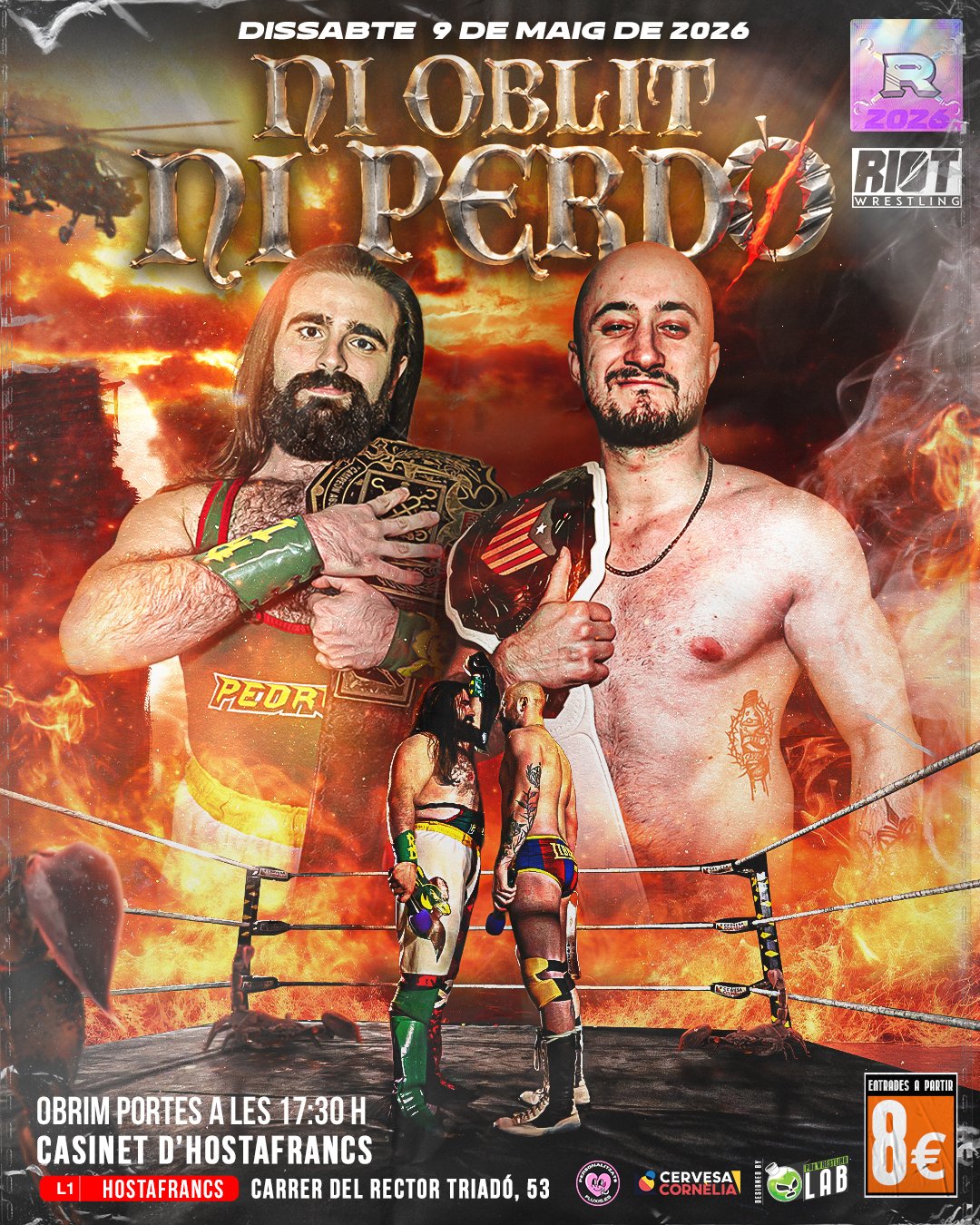
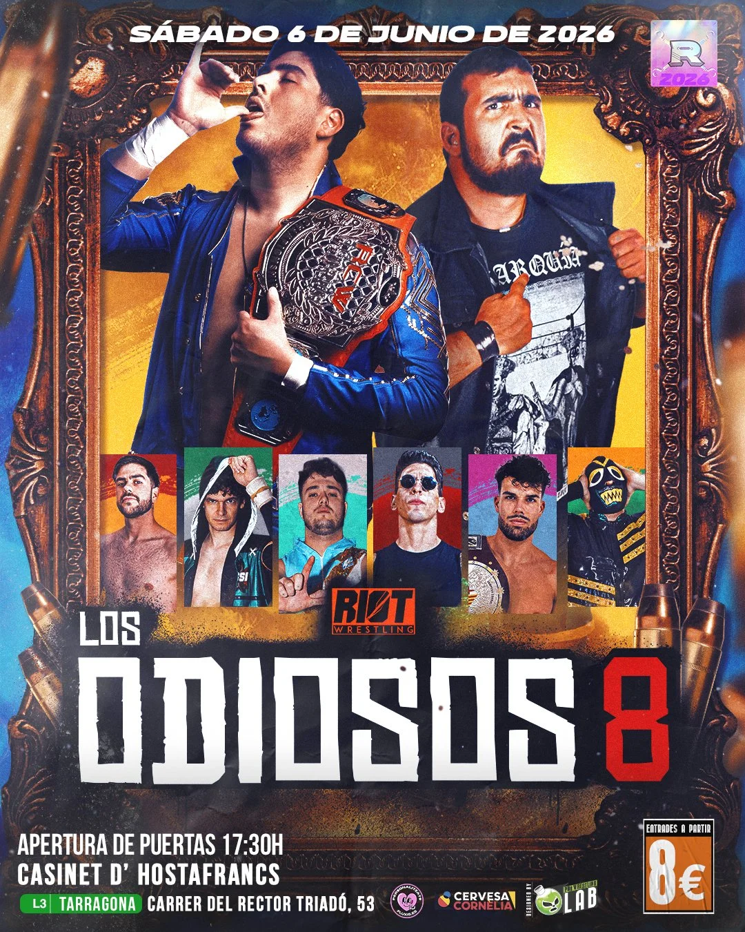
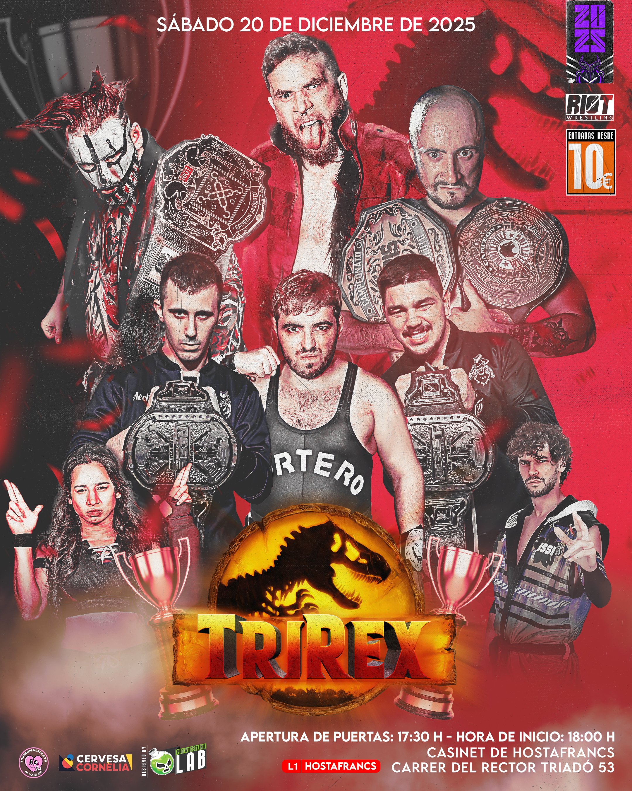
The Concept Didn't Stop at the Poster
None of this lived in isolation. The same concept that shaped a poster (born out of those conversations with the booking team) had to carry through into everything that came after it: titantrons, teasers, every piece of motion content tied to that show. The poster was the starting point, not the whole story.