
Wrestling merch that doesn’t look like wrestling merch & That's Why It Works.
The shirt was already selling before I finished explaining it.
Not because of my name. Not because of my catchphrase. Because someone picked it up at the table, turned to their friend, and said "I don't even know who this is, but I want this."
That's the moment every wrestler is chasing. And most never get there.
Here's the thing nobody wants to admit.
And that's the problem.
Walk down any indie merch table and you'll see the same formula repeated, heavy font, dark colors, a skull somewhere, the wrestler's name front and center. It communicates character. It signals wrestling. It sells to the people already converted.
It does almost nothing for everyone else.
The question I asked myself when I sat down to design my shirt wasn't "what represents my character?"
It was: "what would make someone who has never heard of me stop walking?"
Those are two completely different questions. And they lead to two completely different shirts.
My moniker is La Muerte.
The obvious move writes itself grim reaper, skull, darkness, aggression. Every visual instinct points in the same direction.
And I threw all of it out.
Not because skulls are bad. Because there are already a hundred wrestlers wearing that exact idea. In a sea of skulls, another skull is invisible. You don't stand out by doing what everyone else is doing slightly better. You stand out by doing something nobody else thought to do.
So I asked a different question: how do I represent death in a way that is completely, undeniably mine?
The answer was Tarot.
Not because it is trendy (though it is).
Because it gave me a format that could carry everything at once
A Tarot card is already a world. It has structure, symbolism, visual weight. People who know nothing about wrestling understand instinctively that a Tarot card means something. It has history. It has mysticism. It has cultural weight that exists entirely outside of a wrestling venue.
That was the entry point. Now I had to fill it with me.
This is where the design either works or falls apart
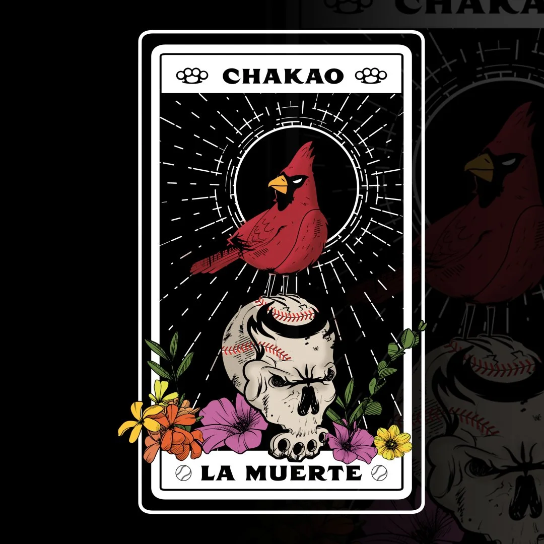
At the top of the card, my name: CHAKAO Clean, readable, ownable. Not a logo treatment, not a stylized font trying too hard. Just the name, where it belongs, in the position that a real Tarot card would carry its title.
The body of the card is where the identity lives
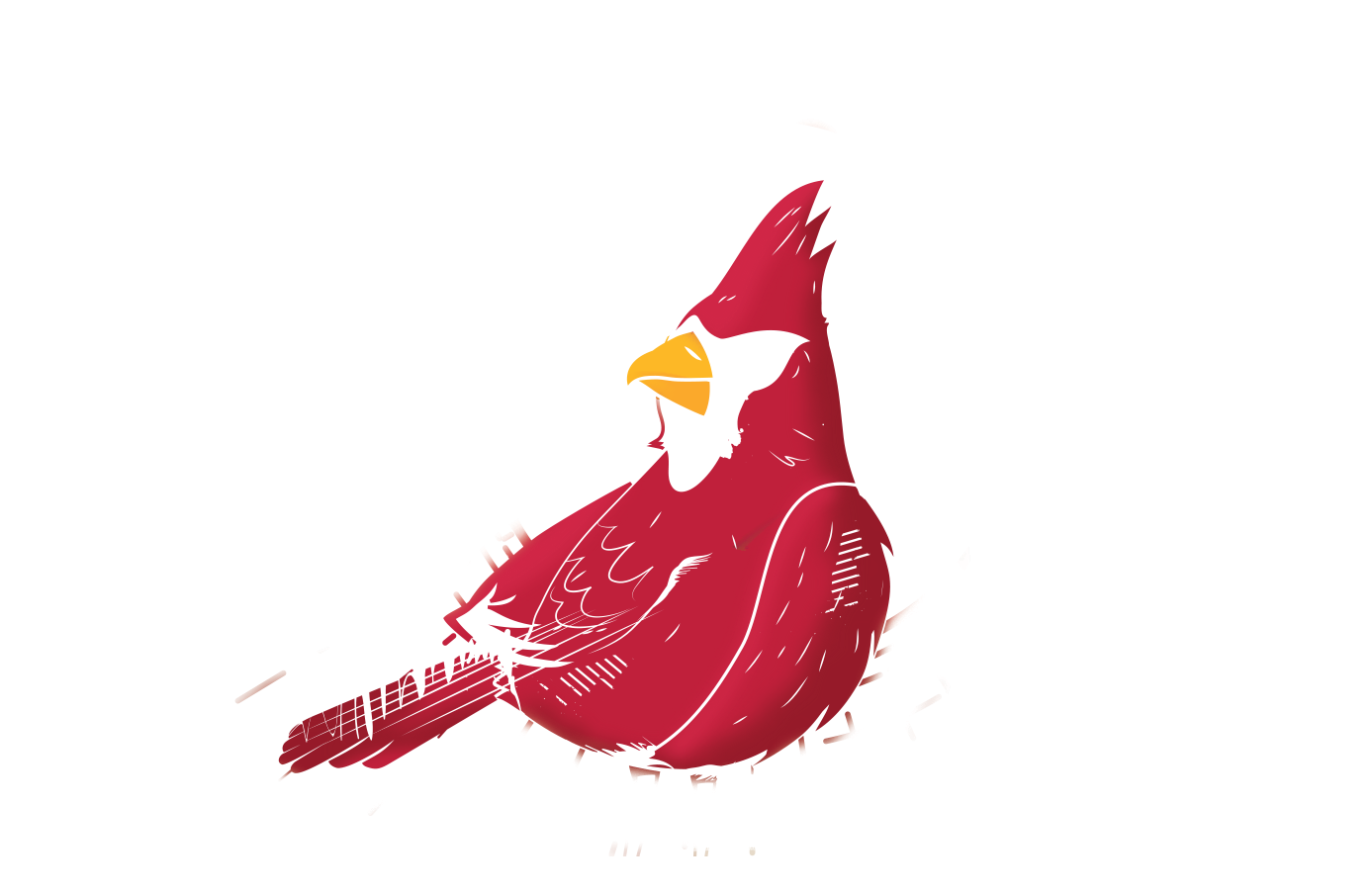
The Cardinal, my hometown bird. An image that means something specific to where I come from, invisible to anyone who doesn't share that context, but immediately resonant to anyone who does.
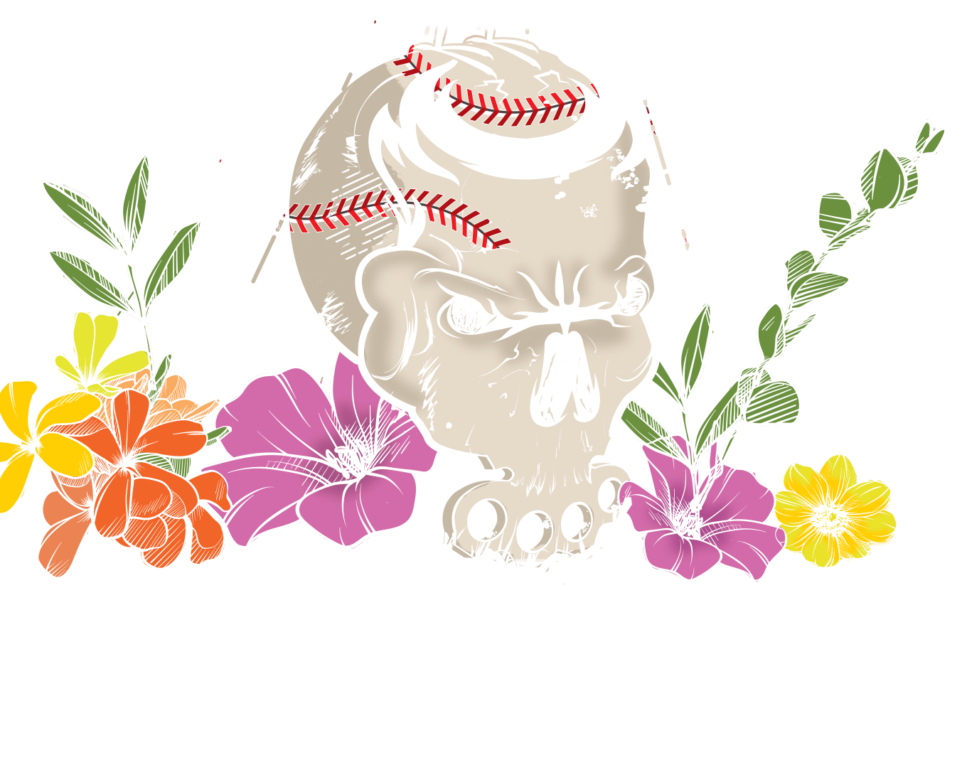
My logo a skull with brass knuckles. The one concession to wrestling iconography, embedded inside the card rather than leading with it. It's there for the people who know. It doesn't demand anything from the people who don't.
Flowers from my home country. Because in Latin culture, flowers and death have always been the same conversation. Día de los Muertos. Offerings. Remembrance. The flowers aren't decoration, they're argument. They're saying death doesn't have to look the way you expect it to.
Every element earns its place. Nothing is filler.
What this shirt actually does, and why it works in both directions
The longtime fan picks it up and reads every layer. The Cardinal, the flowers, the logo they get all of it. The shirt rewards the people who already know the story.
The first-time viewer picks it up and sees a beautifully designed piece with strong visual identity and cultural weight. They don't need the context to want it. The design works without the explanation.
That's the target. Always.
A shirt that only works if you can explain it is a shirt with a dependency problem. The best merch is self-sufficient it communicates value before a single word comes out of your mouth.
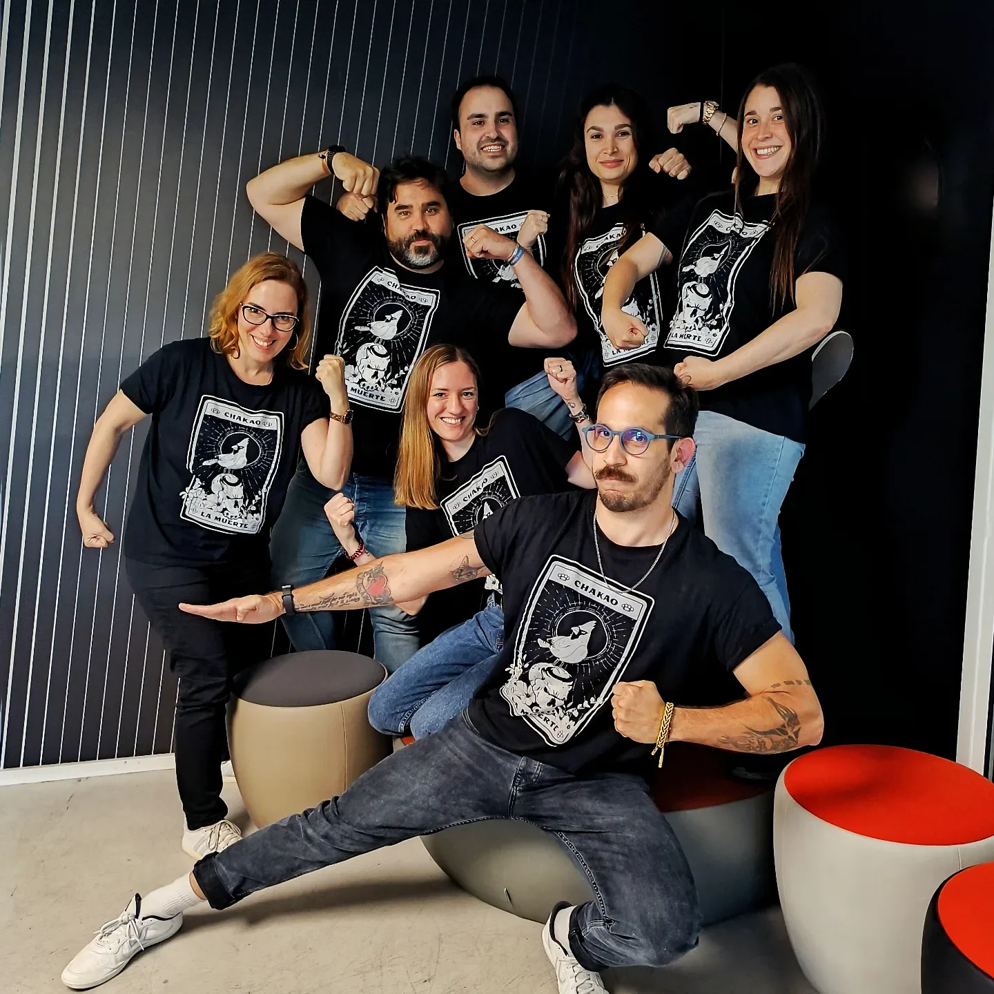
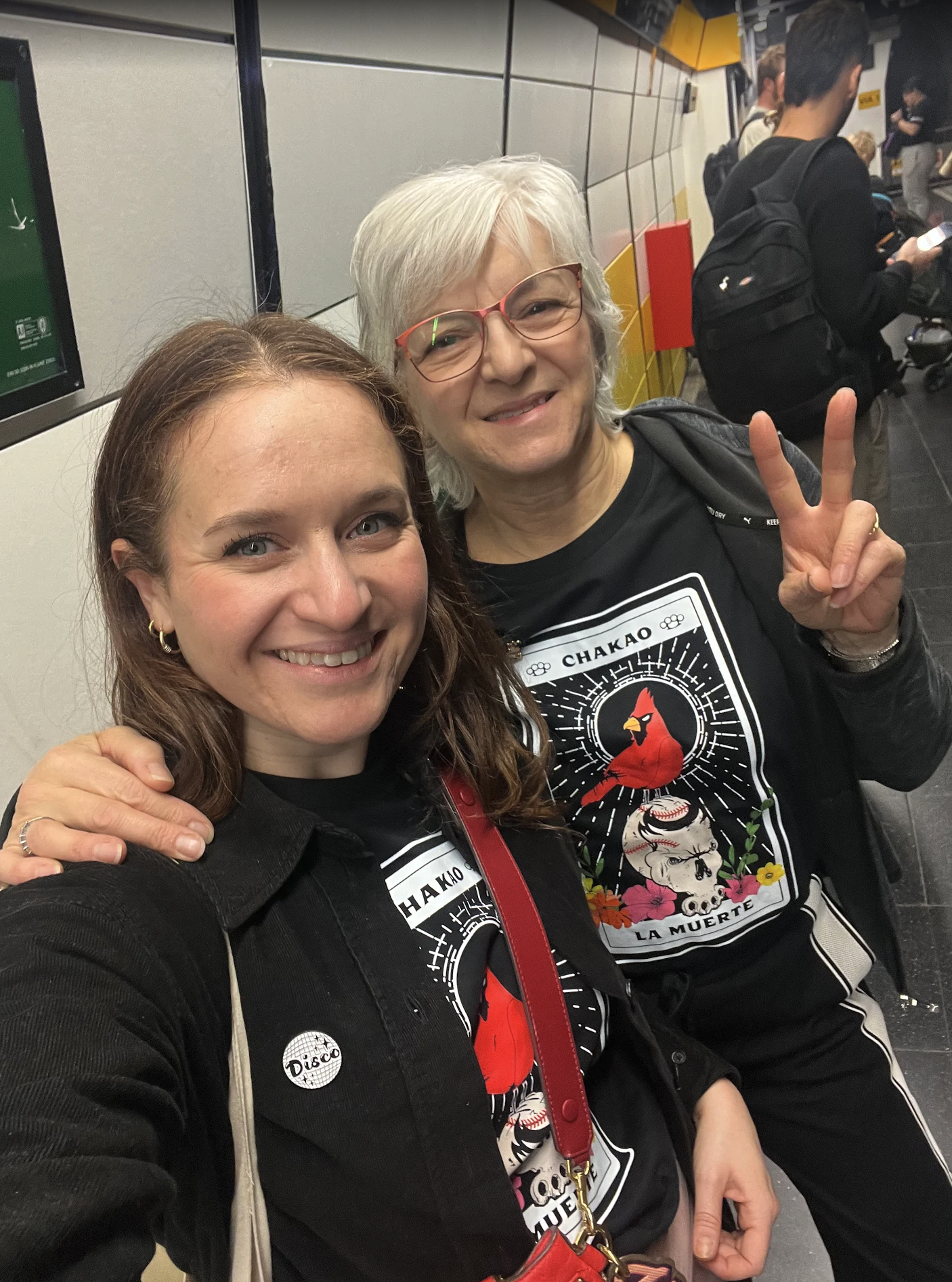
This is what designing like a brand actually looks like
Not "here's my name and my gimmick on a shirt."
A world. A visual language. Something cohesive enough that a stranger can pick it up and feel like they're being let into something worth being part of.
The wrestlers who build merch that outlasts a single angle, a single promotion, a single era of their career, they all understand this. The shirt isn't a souvenir. It's an extension of the brand. It lives in the real world, outside the arena, on people who are doing your marketing for you every time they wear it.
That's the standard worth building toward.
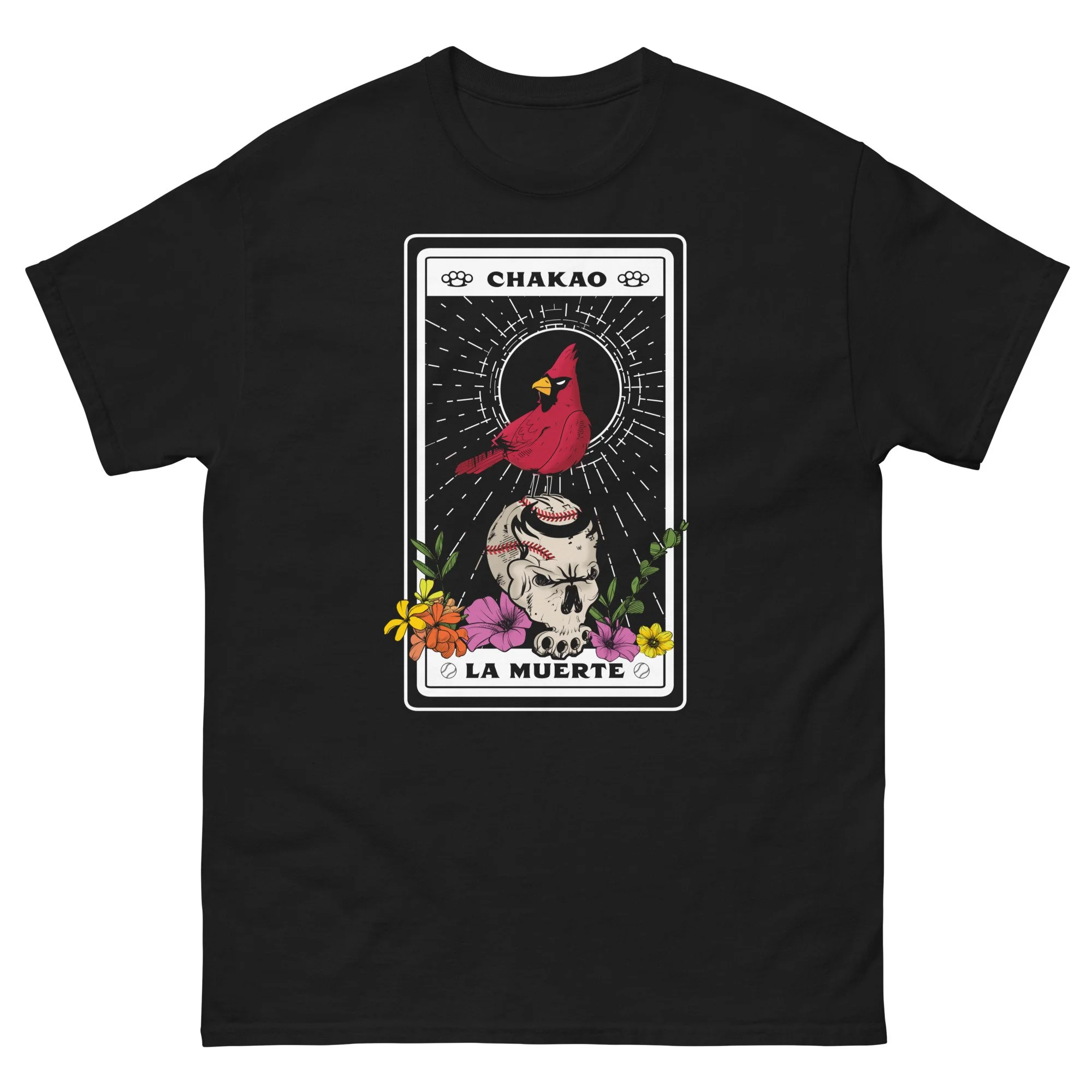
The best-selling tarot design from pro-wrestler Chakao. A hand-drawn illustration featuring Venezuela’s famous red cardinal and Chakao’s skull with brass knuckles.
Official Chakao merchandise.
Sold online exclusively by Pro Wrestling Lab.
Sizing: Runs small - if you like a loose fit take a size up.
100% cotton
Taped neck and shoulders
Double seam at sleeves and bottom hem
Machine washable
