3 Lessons I Learned Rebranding a Wrestling Promotion I Actually Compete In
When you're both the designer and the wrestler, the work has to be honest.
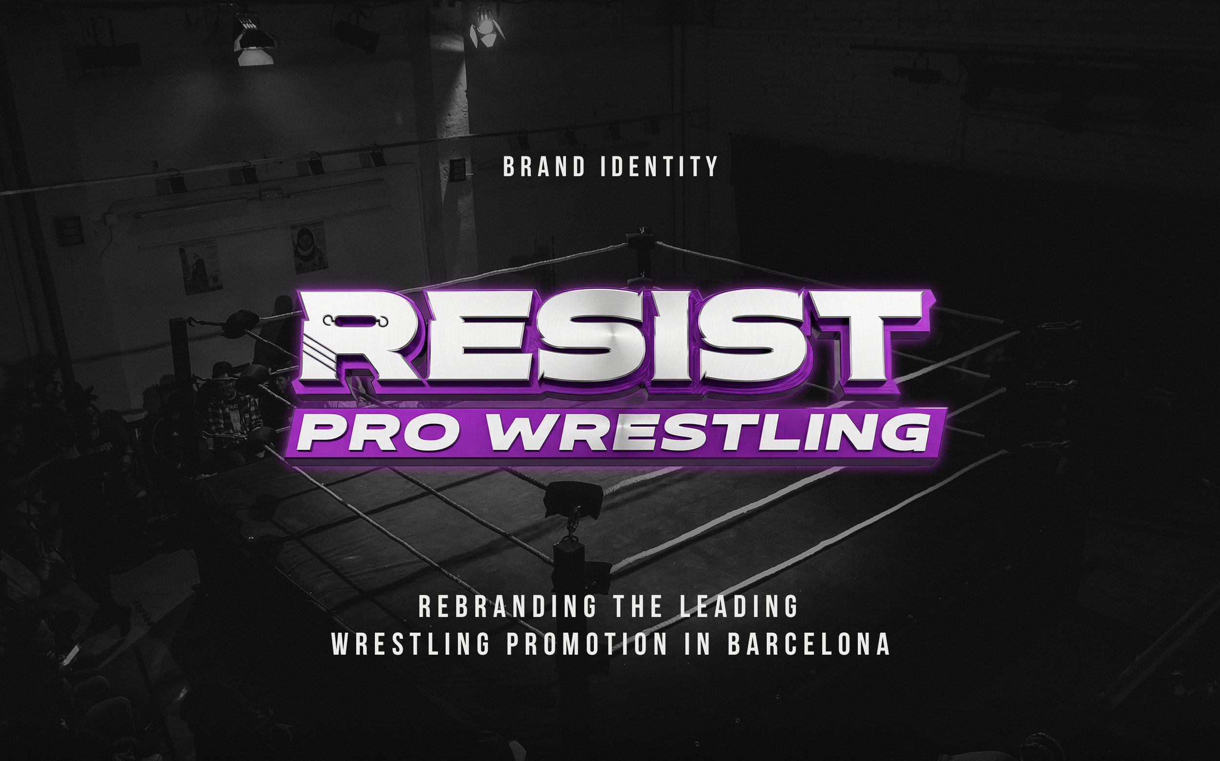
That's the position I was in when Resist Pro Wrestling, Barcelona's leading professional wrestling promotion, needed to evolve its visual identity. I'm the Art Director behind the brand. I also step into that ring as an athlete. That dual role shaped every decision in this project, and it's why this case study exists: not to show a finished product, but to document a process that's still running live at every show, every academy class, every post.
This is what I learned.
The Brand That Built the Spanish Wrestling Scene
For almost seven years, Resist Pro Wrestling operated under a logo that did exactly what it needed to do.
It built a community. It put the promotion on the map in Spain. It gave the brand a face during the years when Resist was establishing itself as the reference point for professional wrestling in Barcelona, with a full roster, a training academy, and a calendar of live events that kept growing.
That logo earned its place. This rebrand wasn't about erasing it.
But the visual language of wrestling was changing around us, globally and locally. Cleaner marks. Stronger systems. Identities built to scale across merchandise, broadcast graphics, social media, and physical spaces simultaneously. WWE, AEW, and the best independent promotions were all moving in the same direction: less complexity, more impact. Logos that worked on a phone screen and a ring mat equally well.
The question wasn't what's wrong with this?
It was: where do we evolve to from here? Do we keep the colors, the shapes? What's been working, and what hasn't? Where is there room to grow?
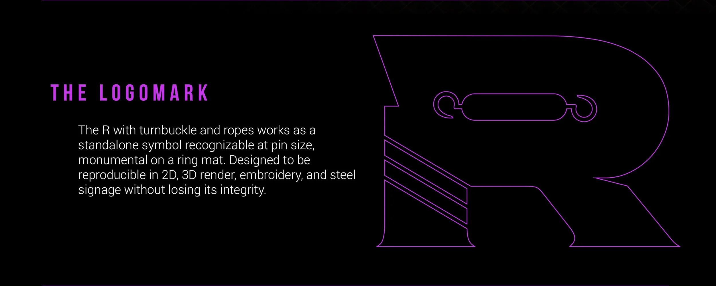
Lesson 1: The Concept Has to Be Authentic; Go Deeper Into the Sport
The first instinct in a rebrand is often to reach for something new. New shapes, new references, new visual territory.
We went the opposite direction. We went deeper into wrestling itself.
Every professional wrestling ring has a turnbuckle, that metal connector that holds the ropes under tension. It's functional, unglamorous, and completely invisible to most audiences. But without it, there's no ring. No match. No show. The turnbuckle is what makes everything else possible.
It became the structural metaphor for the entire brand.
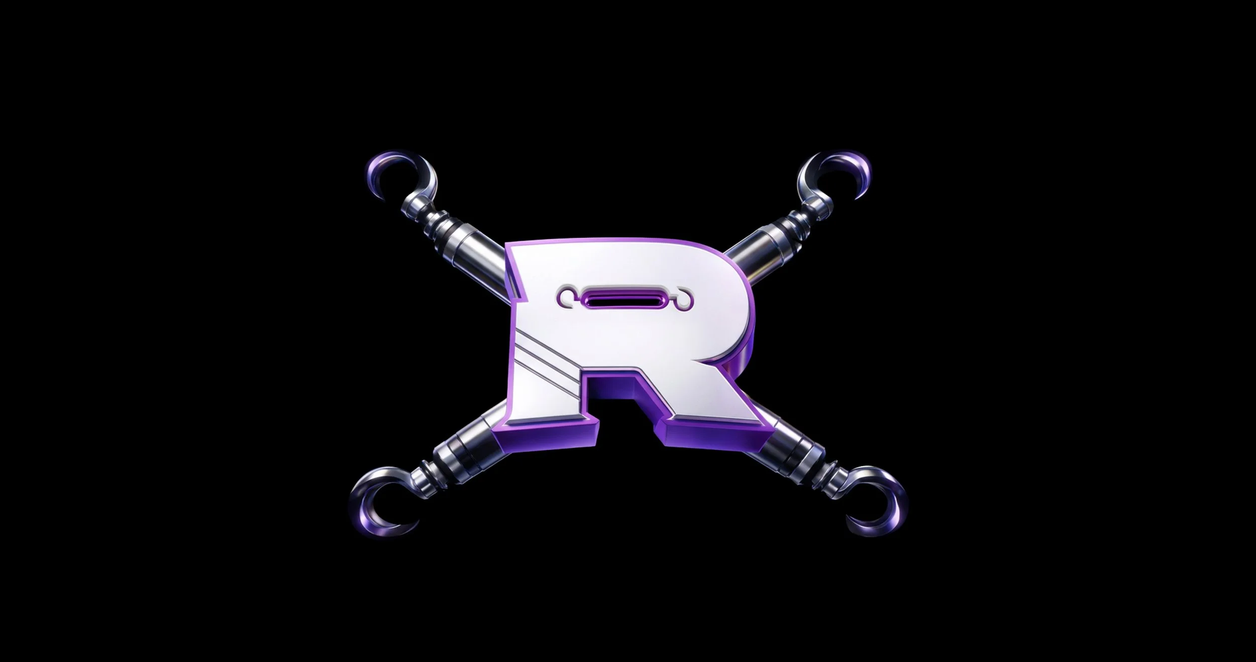
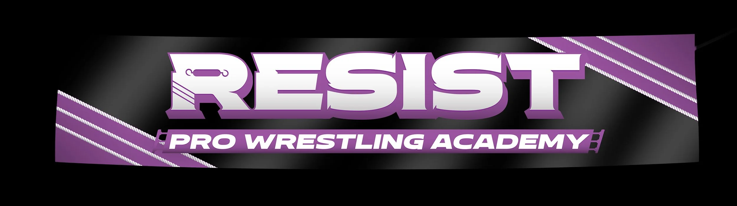
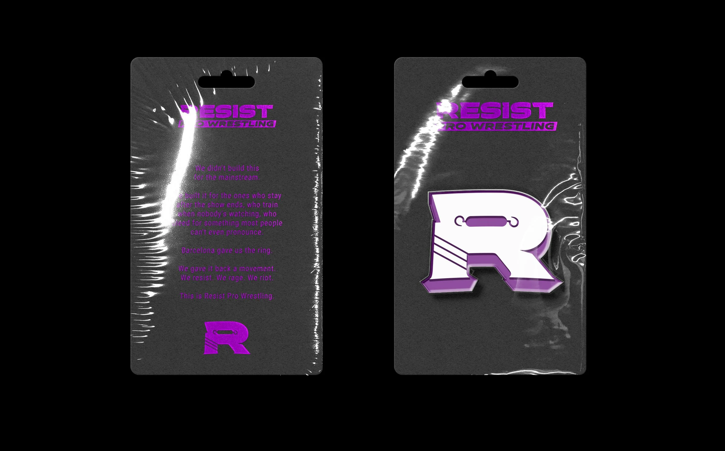
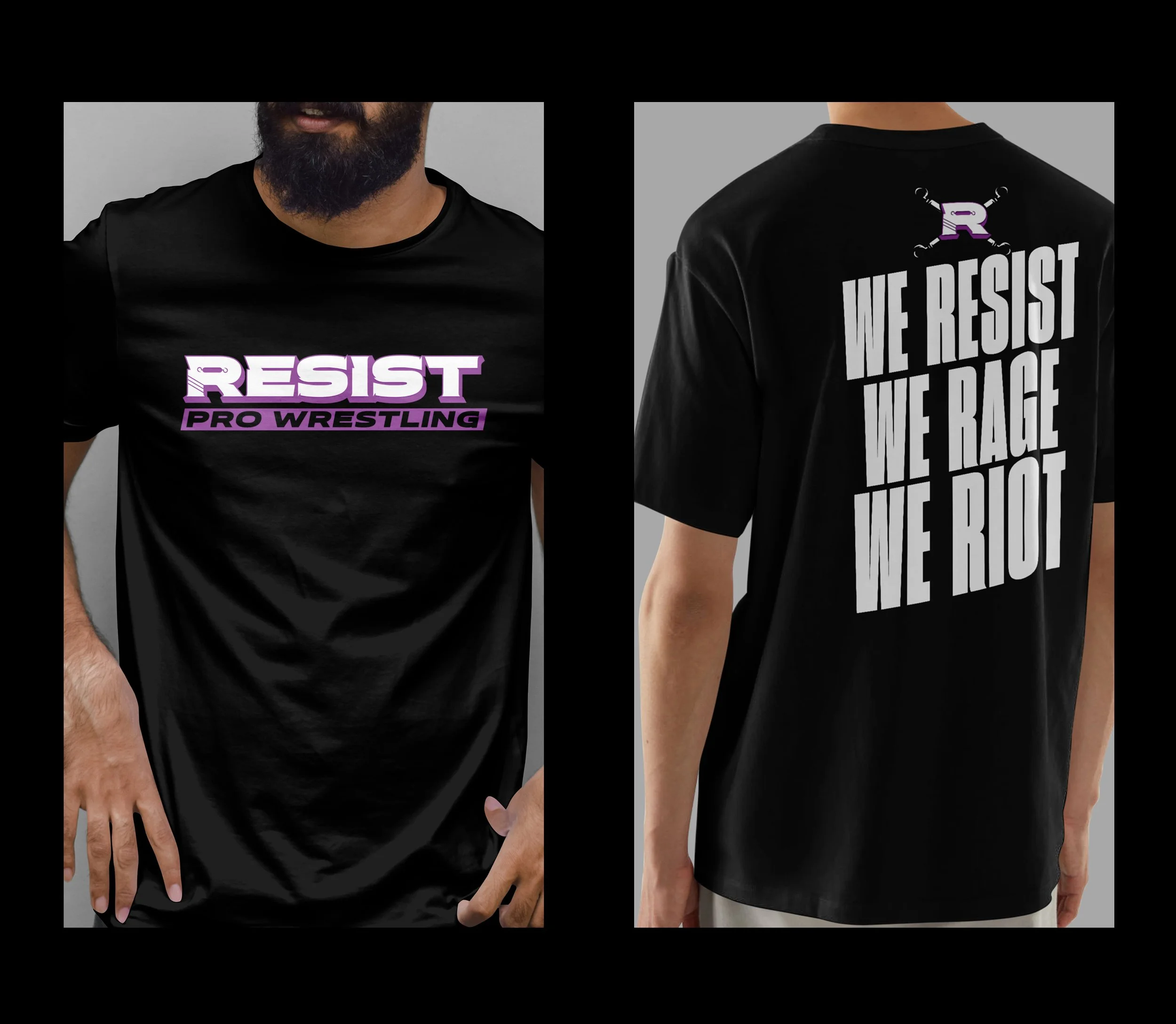
The new "R" carries it literally: the turnbuckle runs through the eye of the letter. Three parallel lines descend through the leg, the three ropes of the ring. This isn't decoration applied to type. It's meaning built into the letterform itself.
The result is a logomark that speaks two languages simultaneously: it reads as a bold, modern typographic mark to a general audience, and as a deeply specific wrestling symbol to anyone inside the industry. That dual legibility was the goal from the beginning.
The lesson: in sports branding, the most powerful concepts don't come from design references — they come from the sport itself. The closer you look at the object, the better the mark.
Lesson 2: Design for the Ecosystem, Not Just the Logo
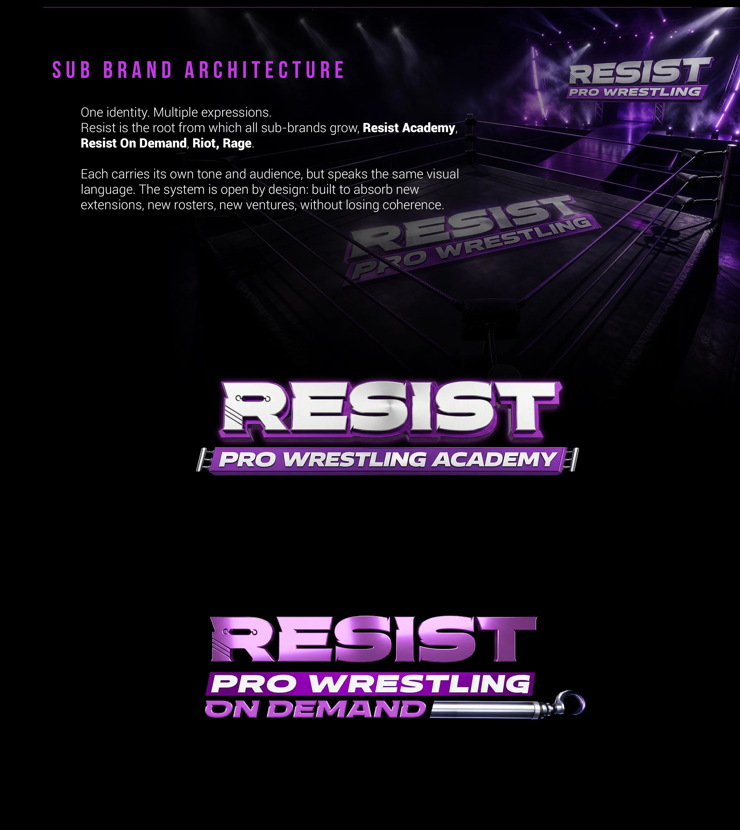
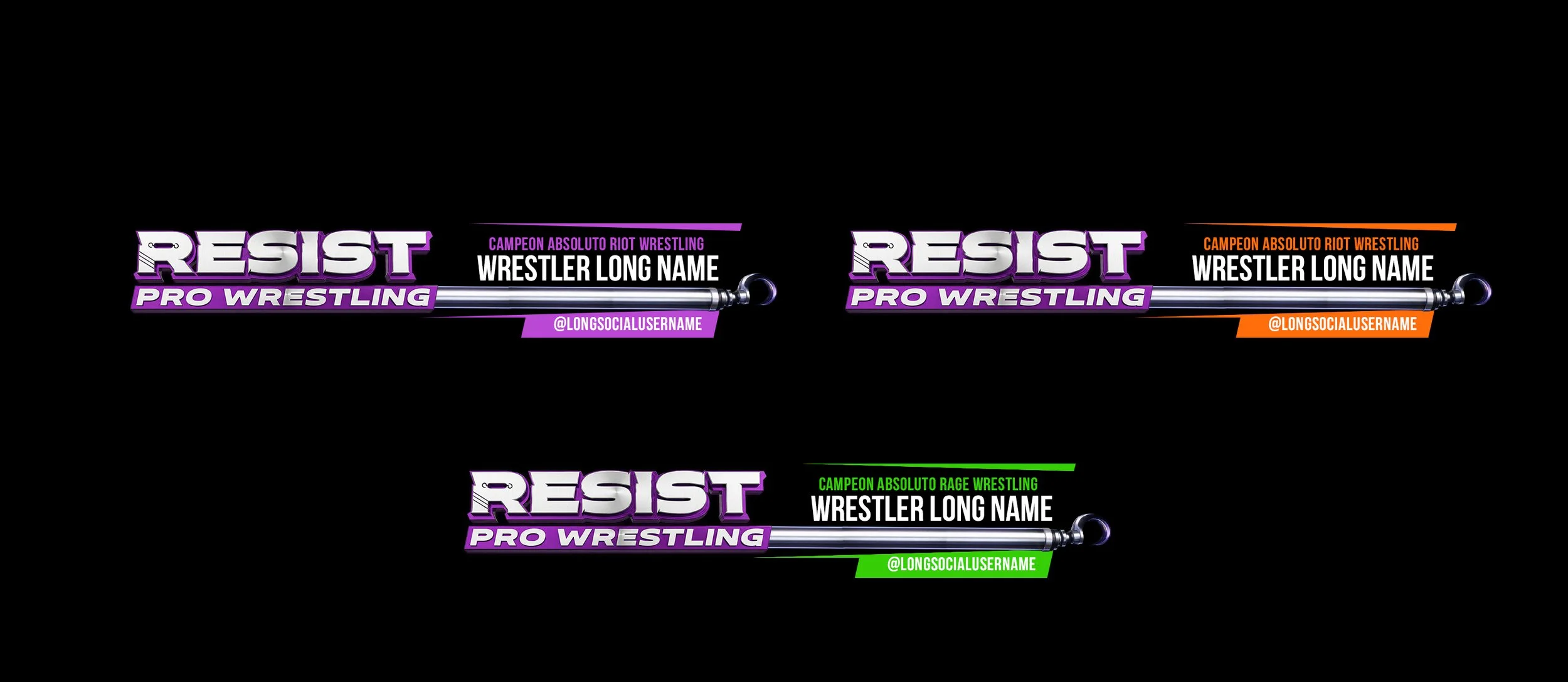
Resist Pro Wrestling isn't one brand. It's several
The parent brand (Resist Pro Wrestling) hosts two established sub-brands with their own rosters and identities: Riot Wrestling (the main roster) and Rage Wrestling (the rising roster). It also operates Resist Pro Wrestling Academy, the training center, and Resist On Demand, its streaming platform.
The old system had no architecture to connect them. Each brand was being built from scratch, without a shared visual language to hold the family together.
The new system was designed from the start to be an ecosystem. Every sub-brand shares the same typographic DNA, the custom letterforms, the turnbuckle, the rope motif. What differentiates them is color and tone: each carries its own personality within the same structural bones.
More importantly, the system is open by design. It can absorb new extensions — a clothing line, a new roster, a media property — without losing coherence. The architecture was built not just for what Resist is today, but for what it becomes next.
The lesson: a logo is a starting point. A brand system is the infrastructure that makes growth possible without starting over every time.
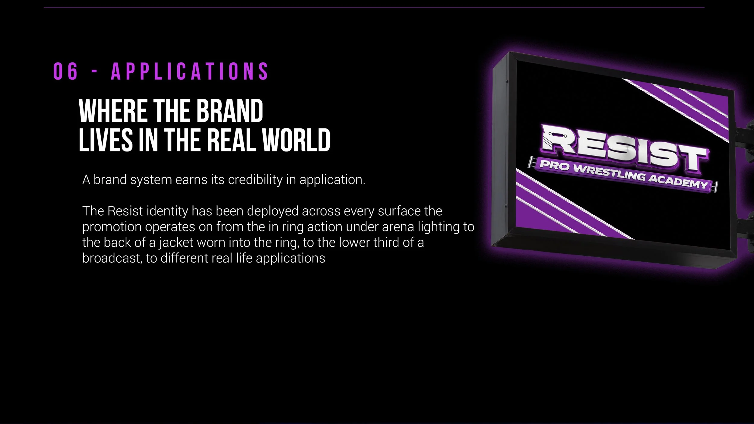
Lesson 3: A Brand Only Proves Itself in the Real World
Case studies live on screens. Brands live everywhere else.
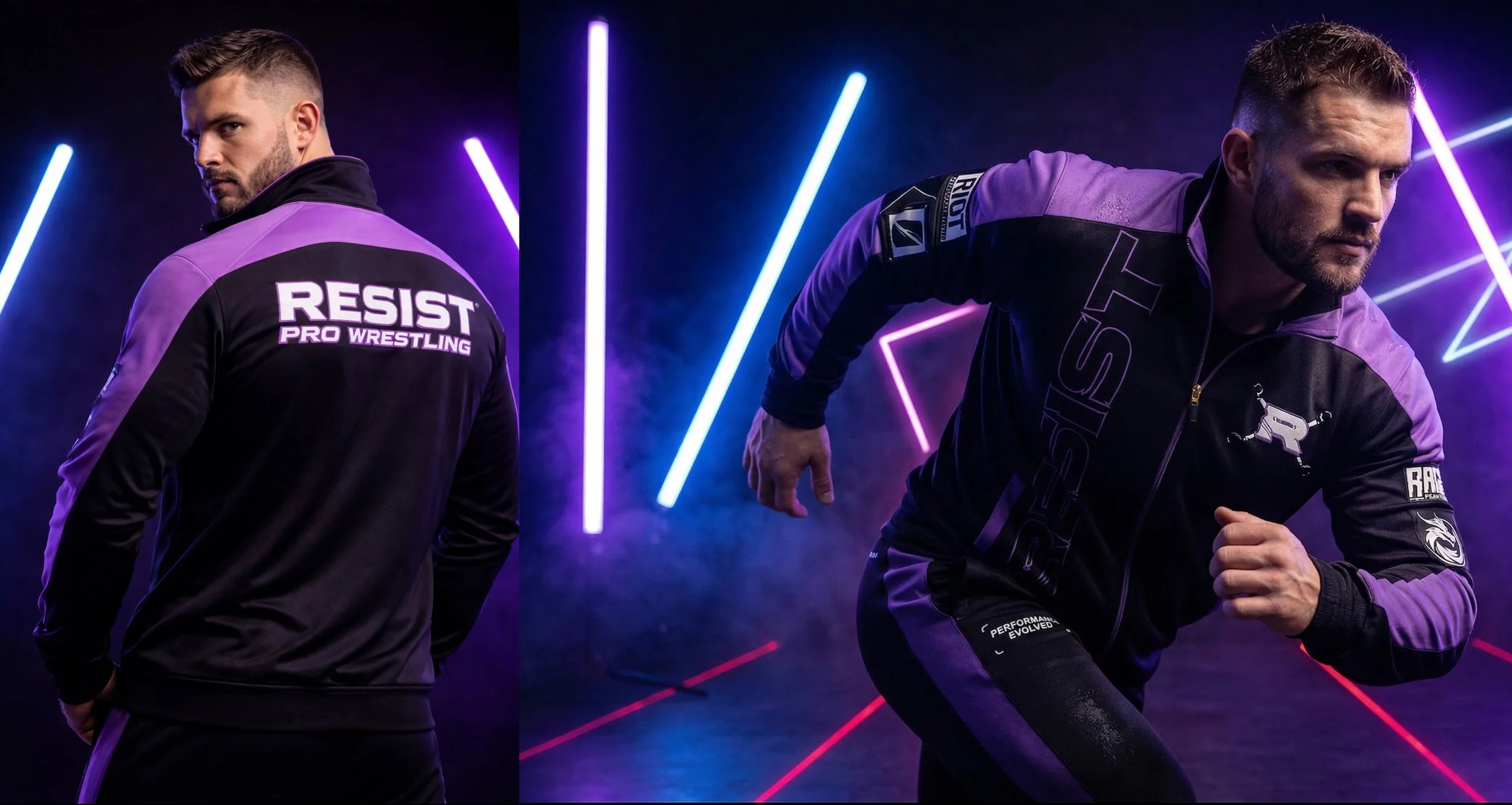
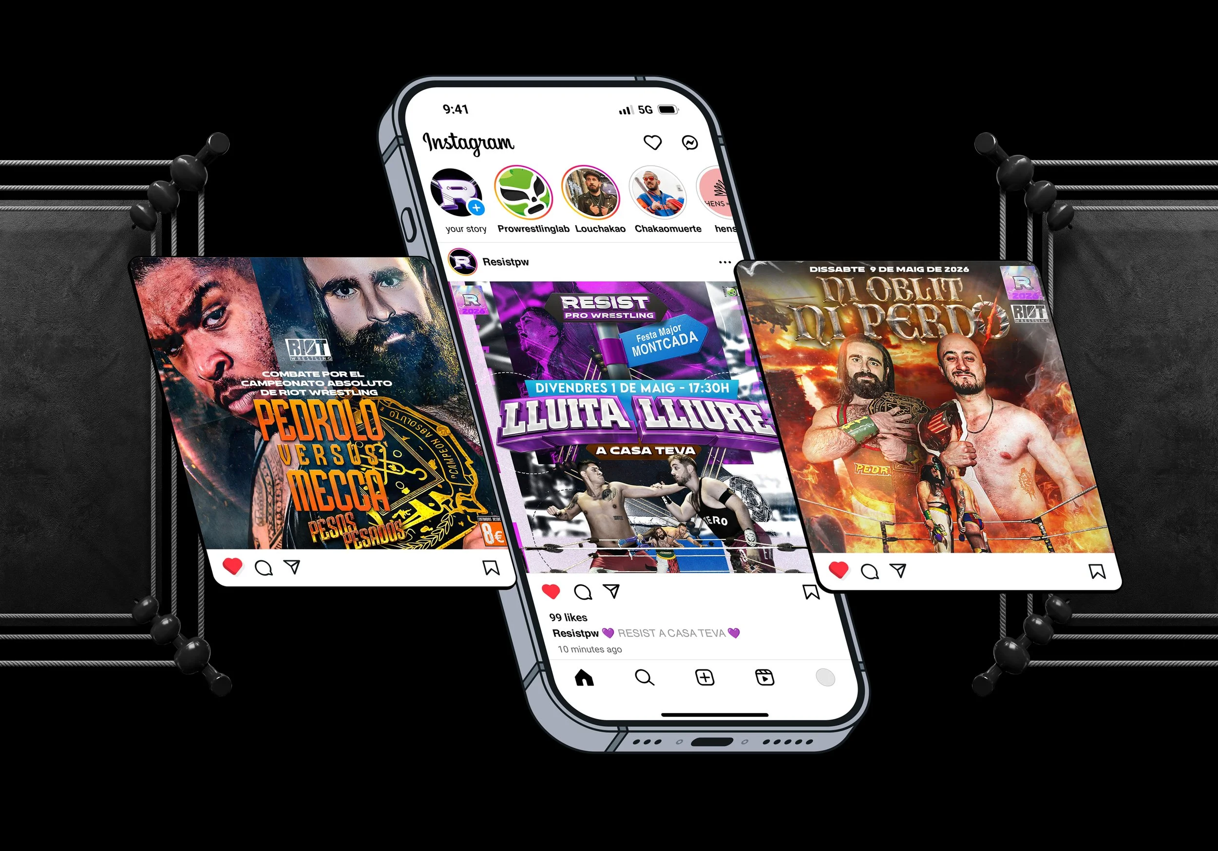
The Resist identity has been deployed across every surface the promotion operates on: ring mats under arena lighting, official tracksuits worn by athletes into the ring, exterior signage at the Academy, lower thirds in broadcast graphics, holographic stickers, event posters in the Barcelona metro, and full wall takeovers on the streets of the city.
Every application is a stress test. Print, embroidery, large-format, small-format, digital, physical — the mark has to hold in all of them. That's why the design process started with reproducibility as a constraint, not an afterthought. No gradients that collapse in print. No complexity that disappears at small sizes. No effects that only exist on screen.
When a poster for a Resist event covered a wall in Barcelona and people walking past stopped to look at it, that was the real proof of concept.
The lesson: design in context from day one. The ring mat, the jacket, the street poster — those aren't applications you add at the end. They're the brief.
What These 3 Lessons Add Up To
Authentic concept. Scalable system. Real world application.
Those three things — in that order — are what separate a logo from a brand. And they're what made the Resist Pro Wrestling rebrand something that works not just on a Behance slide, but in front of a live crowd every single show.
We resist. We rage. We riot.
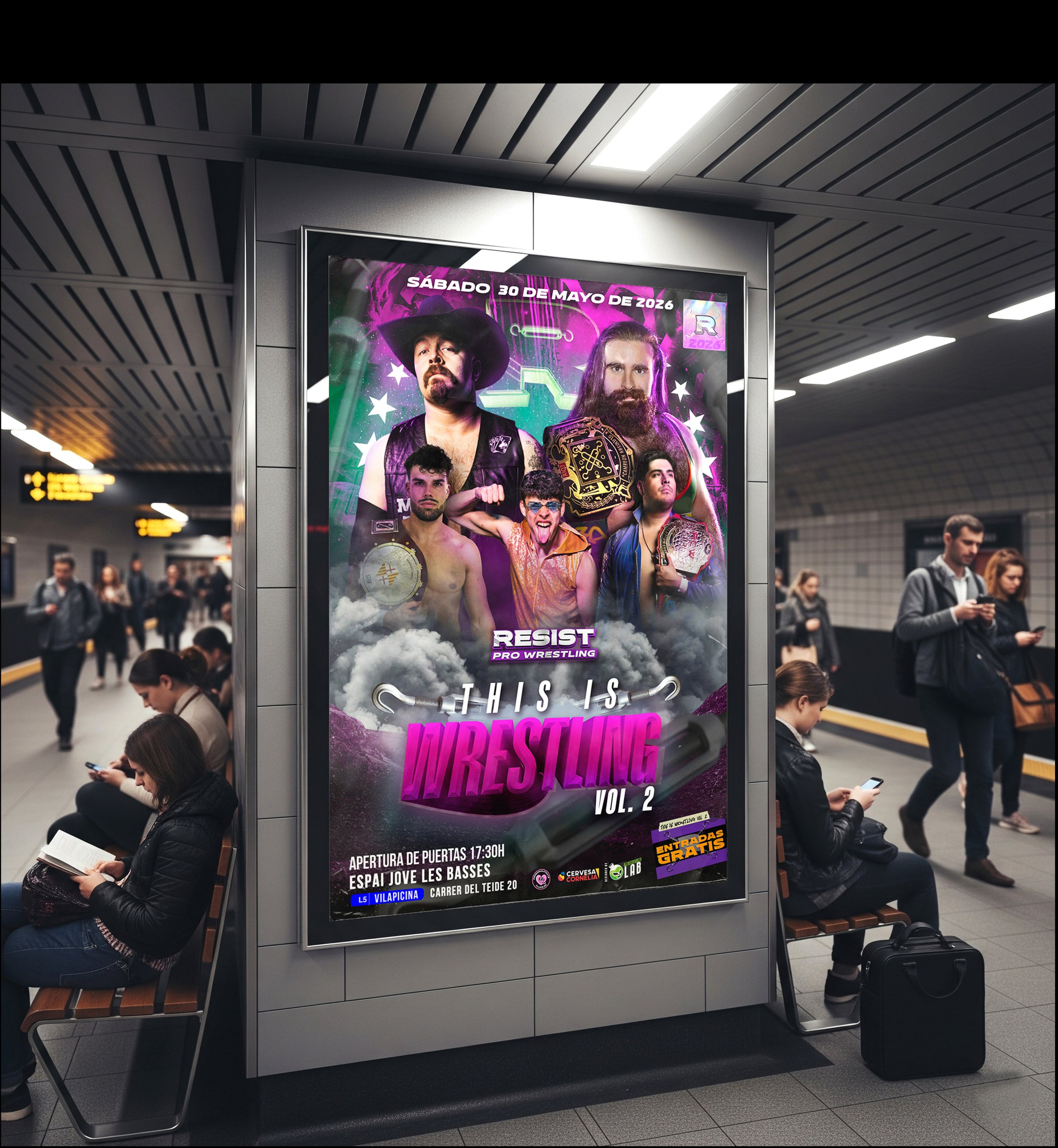
Poster for “This is Wrestling Vol. 2” Spain’s biggest independent wrestling show of 2026 - May 30 2026
Want a Brand System Built for Your Promotion?
Pro Wrestling Lab is a creative studio built by wrestlers, for wrestlers. We design brand identities, visual systems, and creative assets for wrestling promotions and athletes who are serious about how they look to the world.
If you're building something real and need a brand that can grow with it — let's talk.